To Øl
2010 - ongoing
Graphic design and art direction for bottles, cans, merchandise and visual branding for the Danish craft brewery To Øl. To Øl was founded in 2007 and travels the world to create exclusive craft beers and explore the frontiers of brewing. According to ratebeer.com To Øl was ranked as the ninth best brewery in the world in 2014. Their products are sold in more than fifty countries. Since its first commercial release in 2010 To Øl has produced over 250 different beers.
I met the founders of To Øl while we attended the same high school in Copenhagen. back then I did some labels on a xerox machine for the first experimental brews they created in the schools kitchen. In 2010 To Øl released their first commercial beer and again I was summoned to create the artwork. I have been onboard ever since. Today I’m serving as art director and graphic designer for the company. I’m responsible for overseeing all visual aspects of To Øl’s operation from the labels and cans sleeves to the office decoration and merchandise.
Large breweries like Carlsberg, Heineken or Budweiser may only maintain a line of about ten beers which they reproduce again and again. Those breweries may benefit from a very consequent design approach. To Øl’s large portfolio of beers – often consisting of small batches only produced in limited amounts – seems more fit with an open and fluid design strategy. That mirrors the experimental style of the brewery.
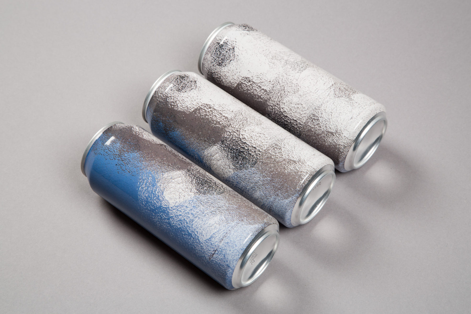
Painting, bad Photoshop effect or the view through a frosted window? Design for Hazy DC NEPA 50cl can.
To Øl has no strict design system or style guide. Each design is a negotiation of what a beer can look like just as each beer is a negotiation of what a beer can taste like. This doesn’t mean that everything coming out of the design department at To Øl is completely different nor is that the goal. There is a loose style running through everything. My vocabularium as a designer is evident in all the designs. It can be compared to an author having a distinct way of writing but engaging with different subjects. This loose approach makes room for a great deal of experimentation and creative freedom. But it’s also means that the visual output is somewhat incoherent. Sometimes the designs are good other times bad and in the worst of cases mediocre.
I’m primarily using typography, photography and abstract forms in my work for To Øl. There has never been made any strategic decision to focus on this areas. They are just my personal focus within visual communication. Coincidentally it also seems to make sense on a strategic level since most craft breweries deploys figurative illustration in one form or another. The photos, text and abstract forms makes To Øl stand out.
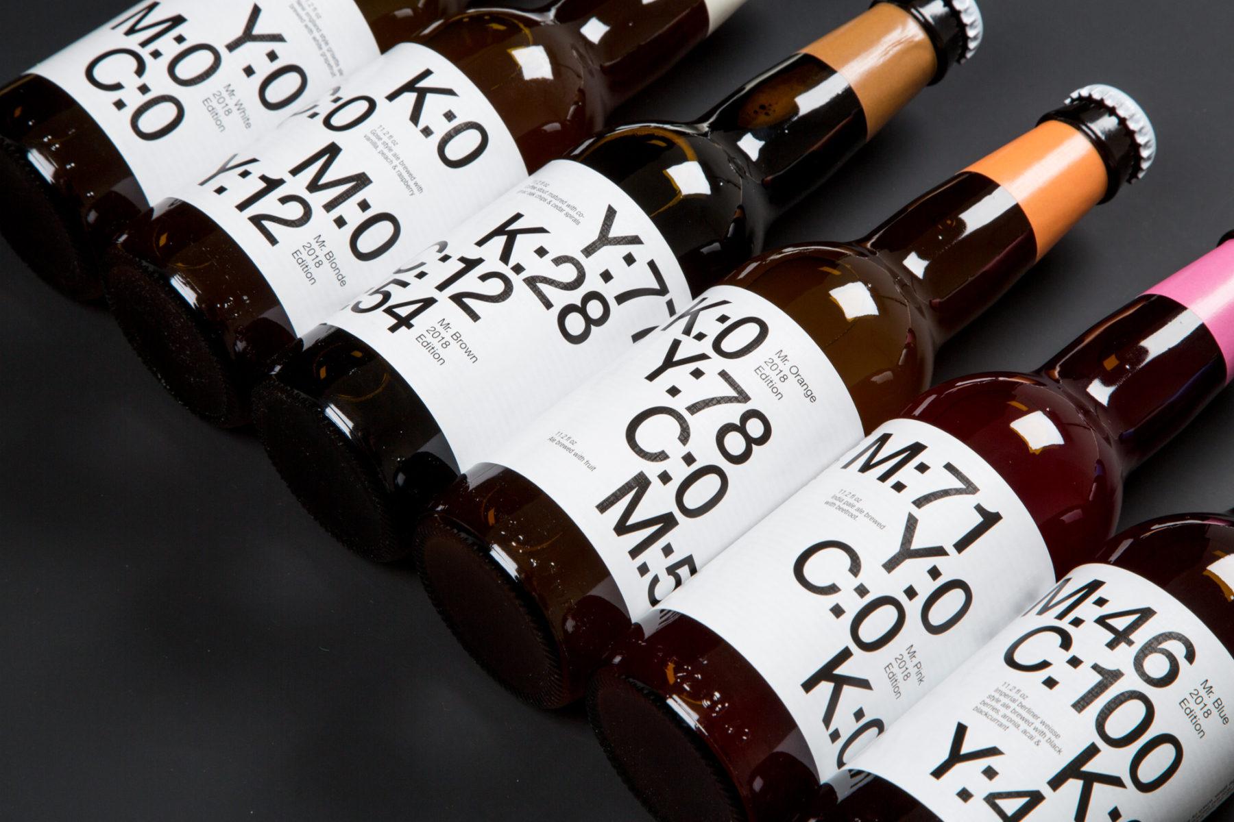
Bottle designs for the Mr. Series 2018.
My work for To Øl is inspired by a wide range of sources like art history, architecture, contemporary art, politics and science. I think that my upbringing in Denmark also plays its part. The graphic design of Per Arnoldi and Bo Linnemann (Kontrapunkt), the architecture of Arne Jacobsen, the furniture of Børge Mogensen and the art of Asger Jorn, Per Kirkeby and Poul Gernes all has a special place in my heart. The names mentioned above does not only function as inspiration but also as someone to rebel against. There influence is so omnipresent in both the public space of Denmark and in Danish mainstream art history that it can almost seems suffocating. But there is no reason in denying their influence on my work for better or for worse.
I consider most of To Øl’s design to be part of the actual experience and not just marketing. I have never subscribed to the idea of considering form and content as different replaceable parts. They are completely intervened. They are actually the same. If you are dining at a michelin star restaurant and the dish looks like shit but tastes nice it will of course ruin your experience. So to have a good product you also need to have good design. Good should not be mistaken with beautiful design. Good design is often what makes us question our understanding of the beautiful.
When designing for To Øl I don’t try to create a direct illustration of the beer. Like drawing a barrel and a cherry on a Barrel aged cherry porter. Beer is an abstract experience a lot like music. You are trying to convey something hard to describe with words. Drinking a beer is much about feelings. The taste, the texture, the carbonation all makes you feel something and might bring back old memories. The alcohol kicks in and the experience gets saturated. Hopefully the visuals can be a part of this process and maybe enlarge it.
Below is a selection of work created for To Øl.
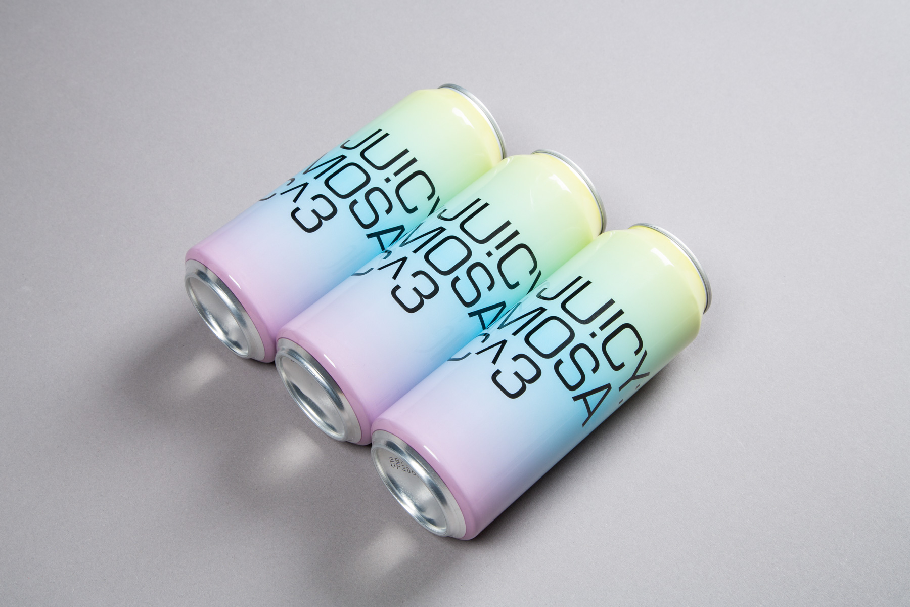
Futuristic sixties typeface meats pastel coloured eighties gradient. Can design for Ju!cy: Mosaic^3.
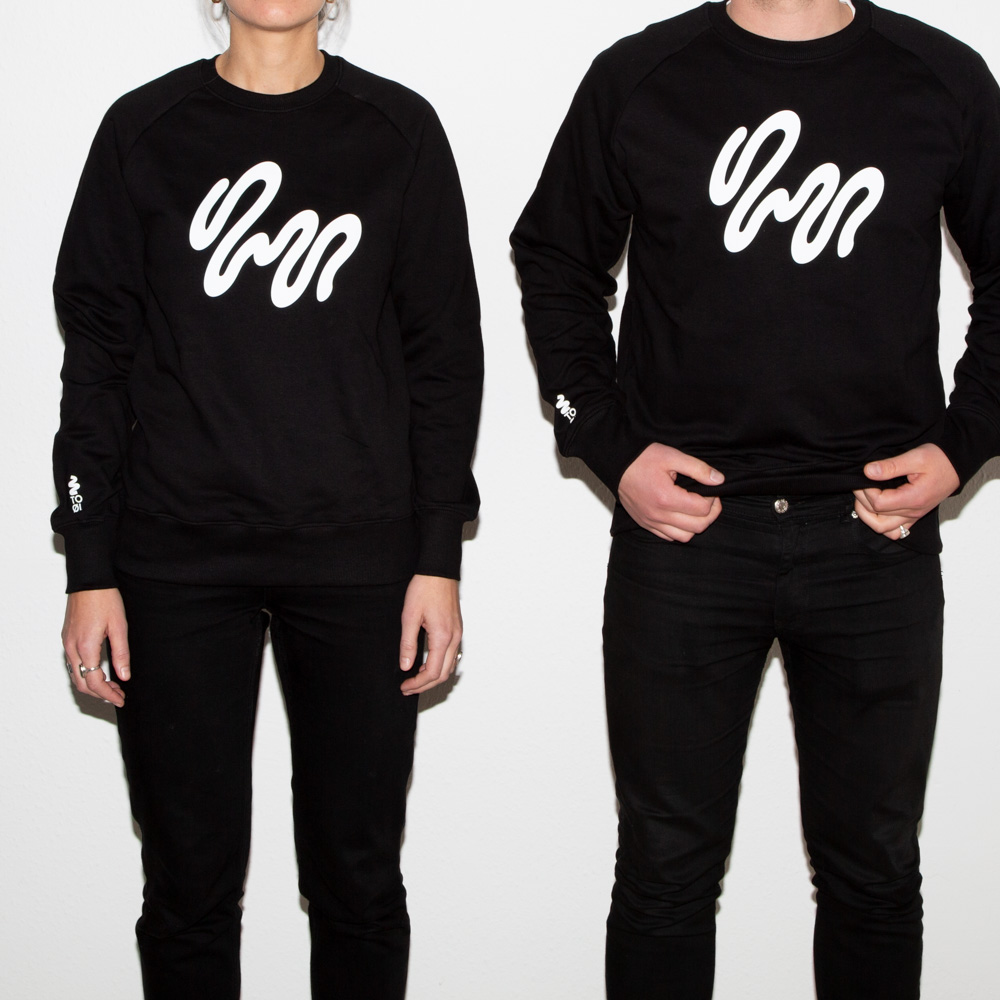
At To Øl we have increasingly been deploying these doodle like graphic elements. They are made using a drawing tablet and acts as a reference to bacteria and germs which are important ingredients in beer production. When making them they almost feels like pieces of hand made calligraphy even though they don’t contain any letters. Here a bacteria doodle has been printed on a black cotton sweatshirt.
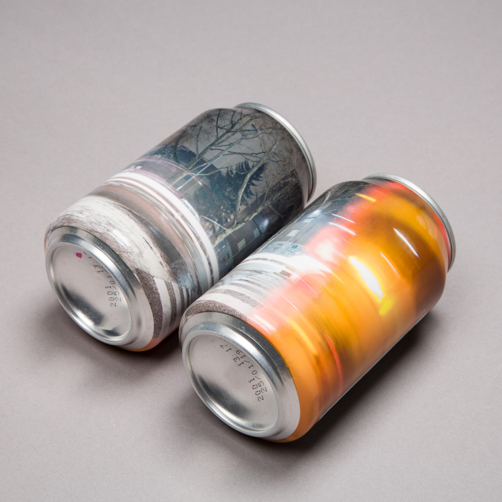
Design for “Dangerously Close to New England”. Something is partially blocking the cameras view while it is producing a long exposure image and causing a part of the photo to become blurry and distorted. Could it be coloured glass or a crystal or maybe a draft beer?
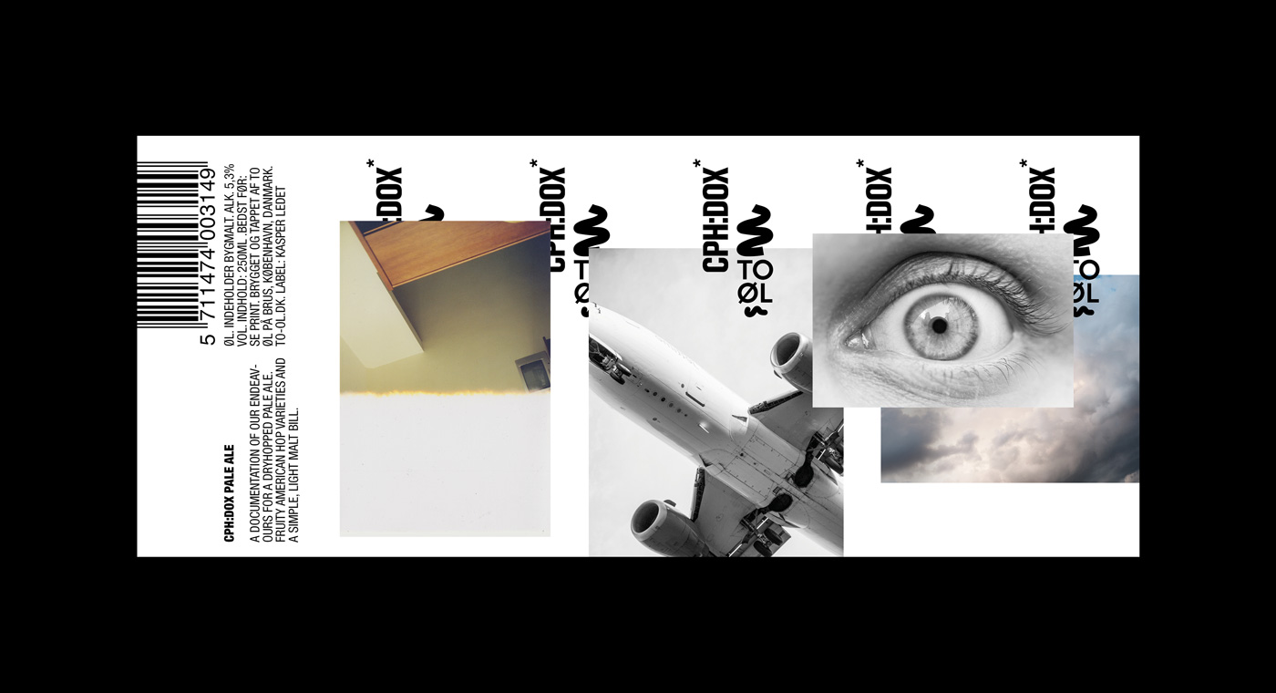
Label design for the official CPH:DOX beer. CPH:DOX is a Copenhagen based documentary festival. The design features various photographs some is referring to films or the act of seeing others is referring to the graphic universe of To Øl. Together they form a kind of abstract narrative that is not telling a linear story but points is various directions. Some of the photos are staged others are real situations and some are accidents. This represents the wide scope of approaches to making documentary films.
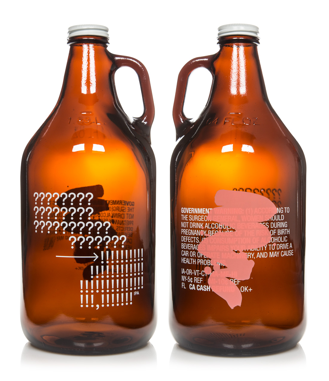
64oz growler design. There is some action painting over some vital information which in this case is the disclaimer required on beers sold in the US. It is not meant as a protest against the disclaimer. It is more about elevating something usually hidden away on the back label to the centre stage. A kind of appropriation. The painting is of course not done directly on the growler but on a paper that has then been scanned, vectorized and then silkscreen printed over the disclaimer which makes the text visible through the paint stroke. On the other side there is a piece of abstract concrete poetry originating from the beer “?! IPA”.
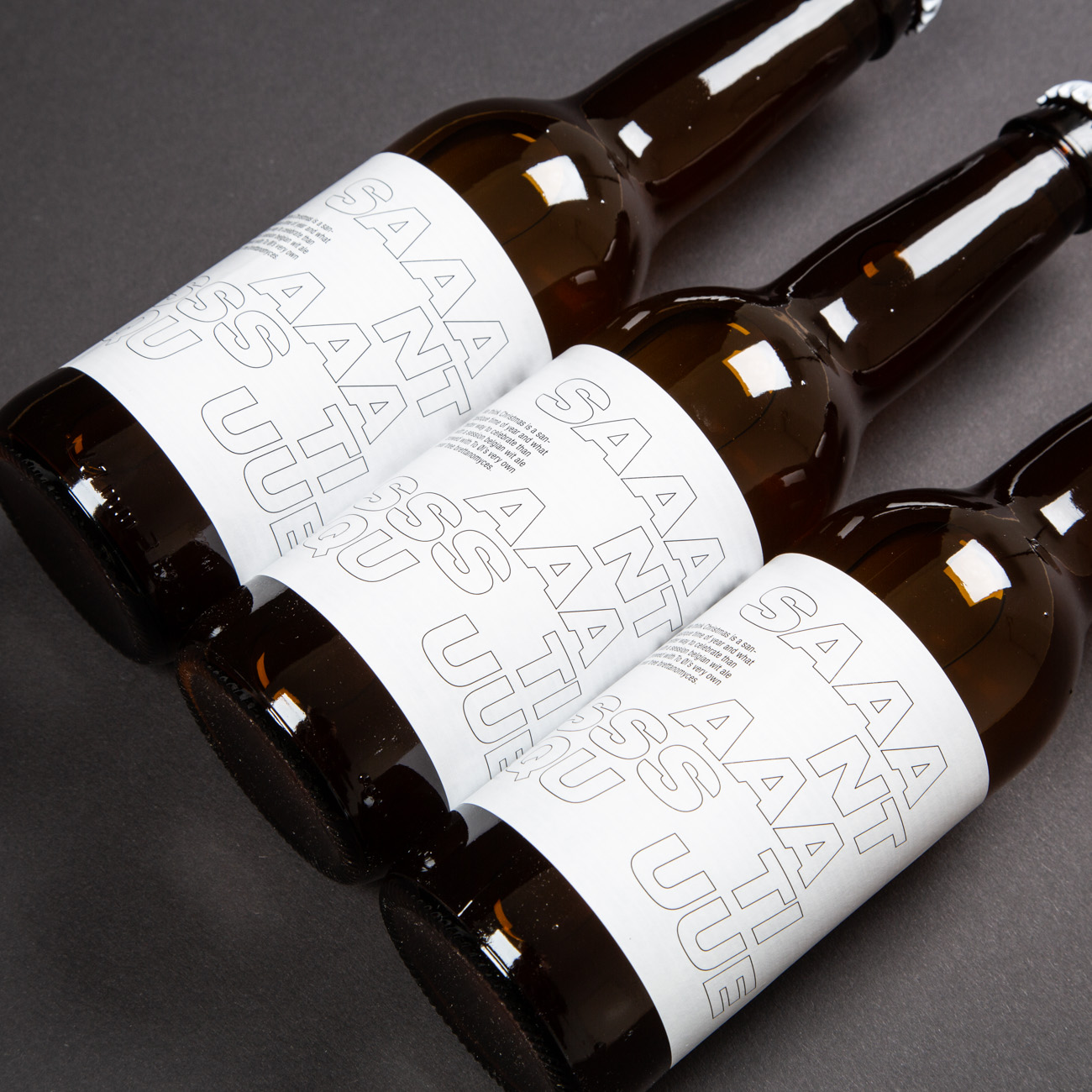
33cl bottle and 50cl can designs for the Christmas beer “Santastique”. When designing something Christmas related there is always the question of how it should relate to the aesthetics of Christmas. For this beer the name was so much of a reference to Santa that I decided to go stickly typographical. The typeface is maybe more associated with racing cars and dance music then Christmas trees and reindeers. It is a kind of countermeasure to the often cute and colorful visuals associated with that time of the year. The name has been cut up and additional letters has been added as a way to further deconstruct the cosy holiday feeling.
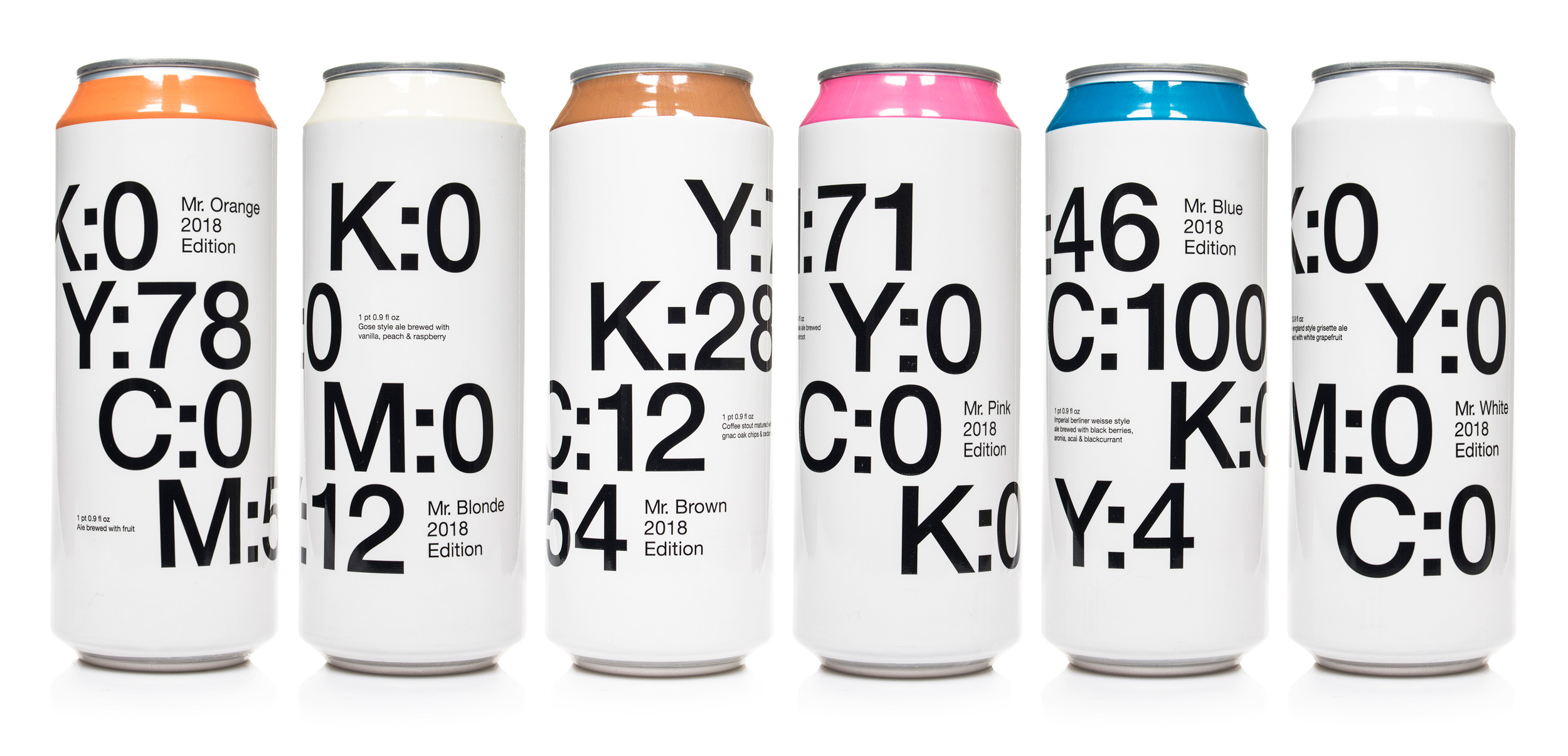
Can designs for the 2018 edition of the “Mr. Series”. Each beer is named after a colour. These colours directs the ingredients in the beers. Mr. Pink is brewed with beetroot, Mr.Brown is a coffee stout and so on. The designs consist of the CMYK code for each individual colour written in large type. CMYK is a standard colour model widely used in the printing industry. The actual colours are printed around the neck on the bottles and on the top part of the cans. The designs becomes self referential and is also pointing to the act of doing graphic design in general. I wanted to avoid any literal references to the ingredients, like having a coffee mug on the coffee stout, in favour of a more formal approach.
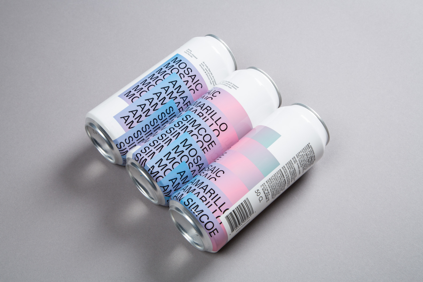
Can and bottle design for 3Xmas.
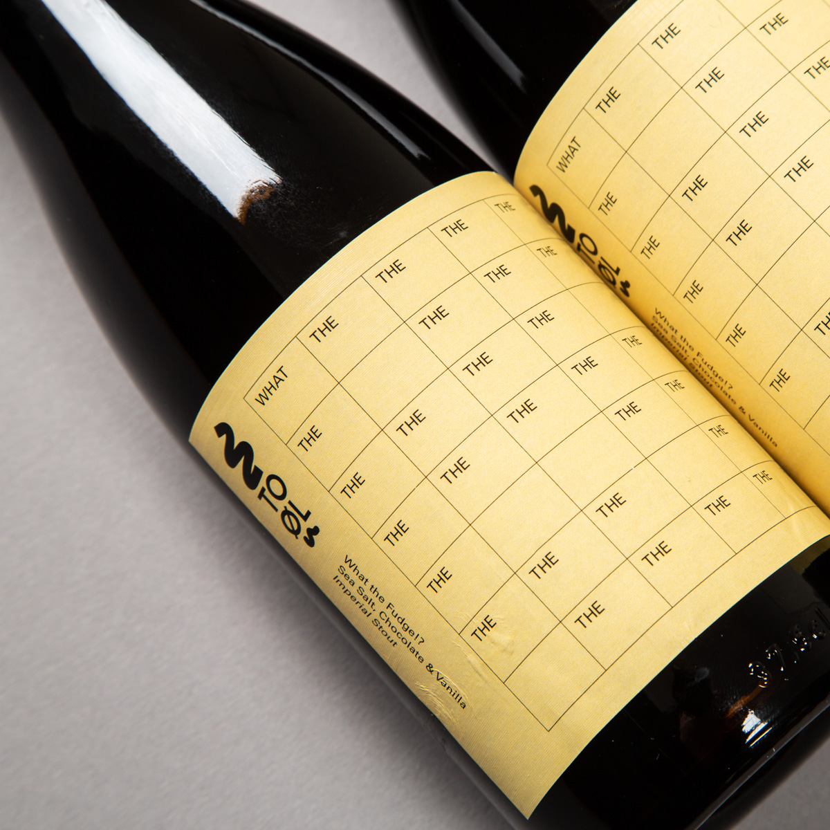
Label design for What the Fudge?!
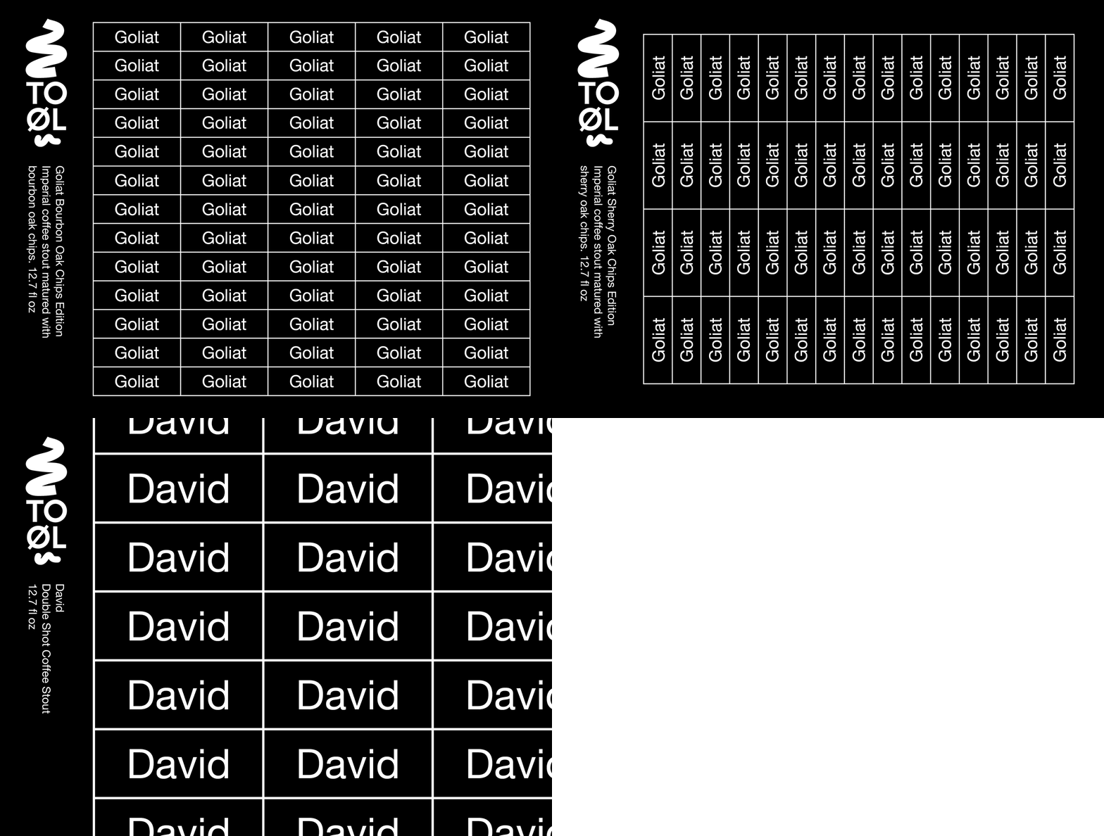
Our lives as an endless sequence of repetition or the nonhierarchical visual structure of a spreadsheet. Here it is David - Double Shot Coffee Stout, Goliat Bourbon Oak Chips Edition and Goliat Sherry Oak Chips Edition.
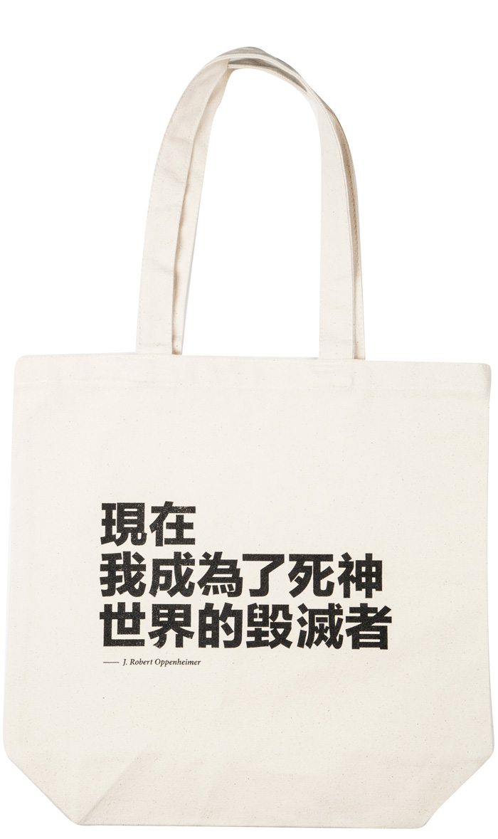
Detail from the official To Øl tote bag with af quote by Oppenheimer in Chinese.
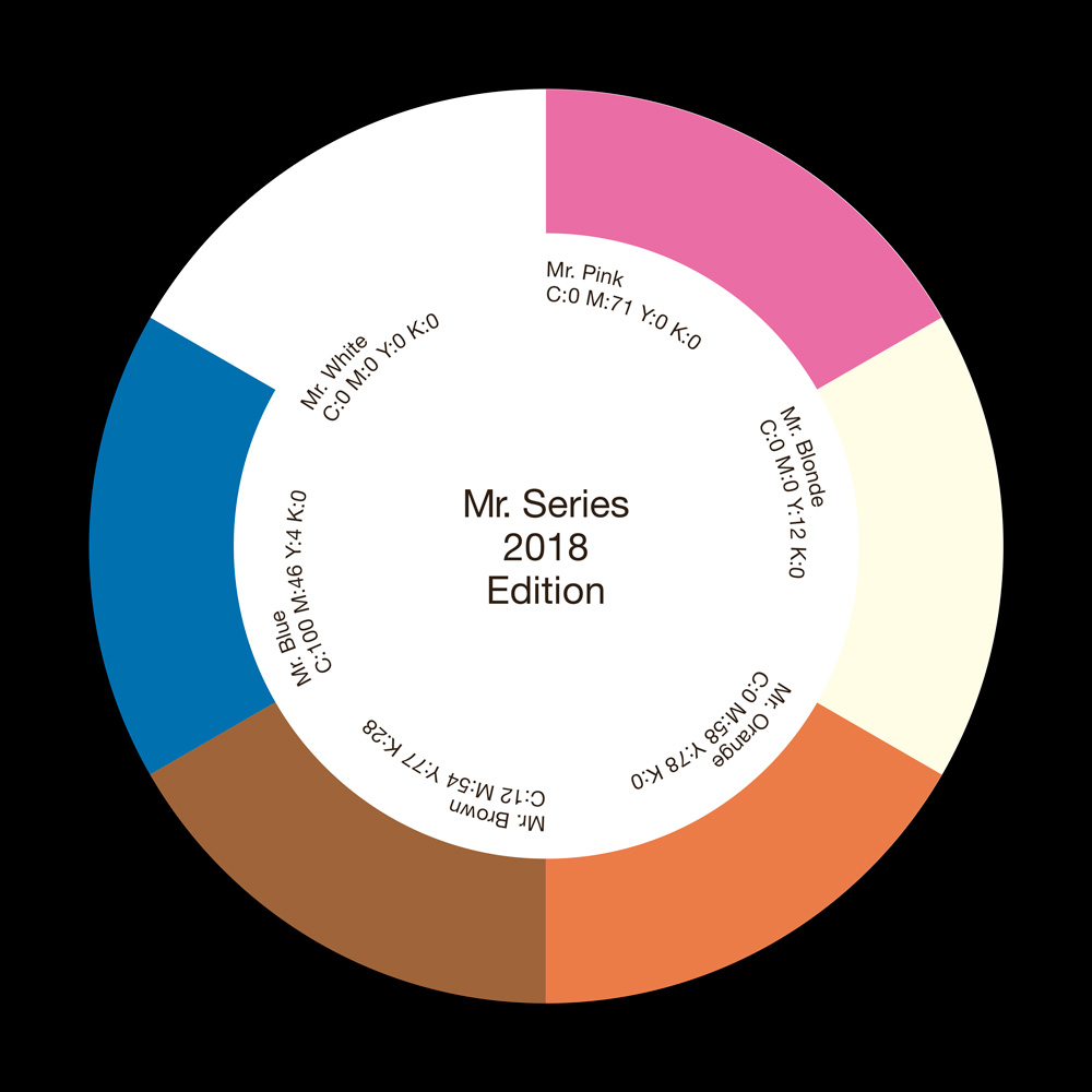
Coaster designed to promote the 2018 edition of the “Mr. Series”. Since each instalment in the series is attributed to a colour and since the coaster is round it seemed straightforward to create a colour wheel. The name of each beer along with the corresponding CMYK code and the actual colour is displayed in a circular layout. The coasters is distributed to bars internationally and hopefully people will be drinking the “Mr. Series” beers with it underneath their glasses.
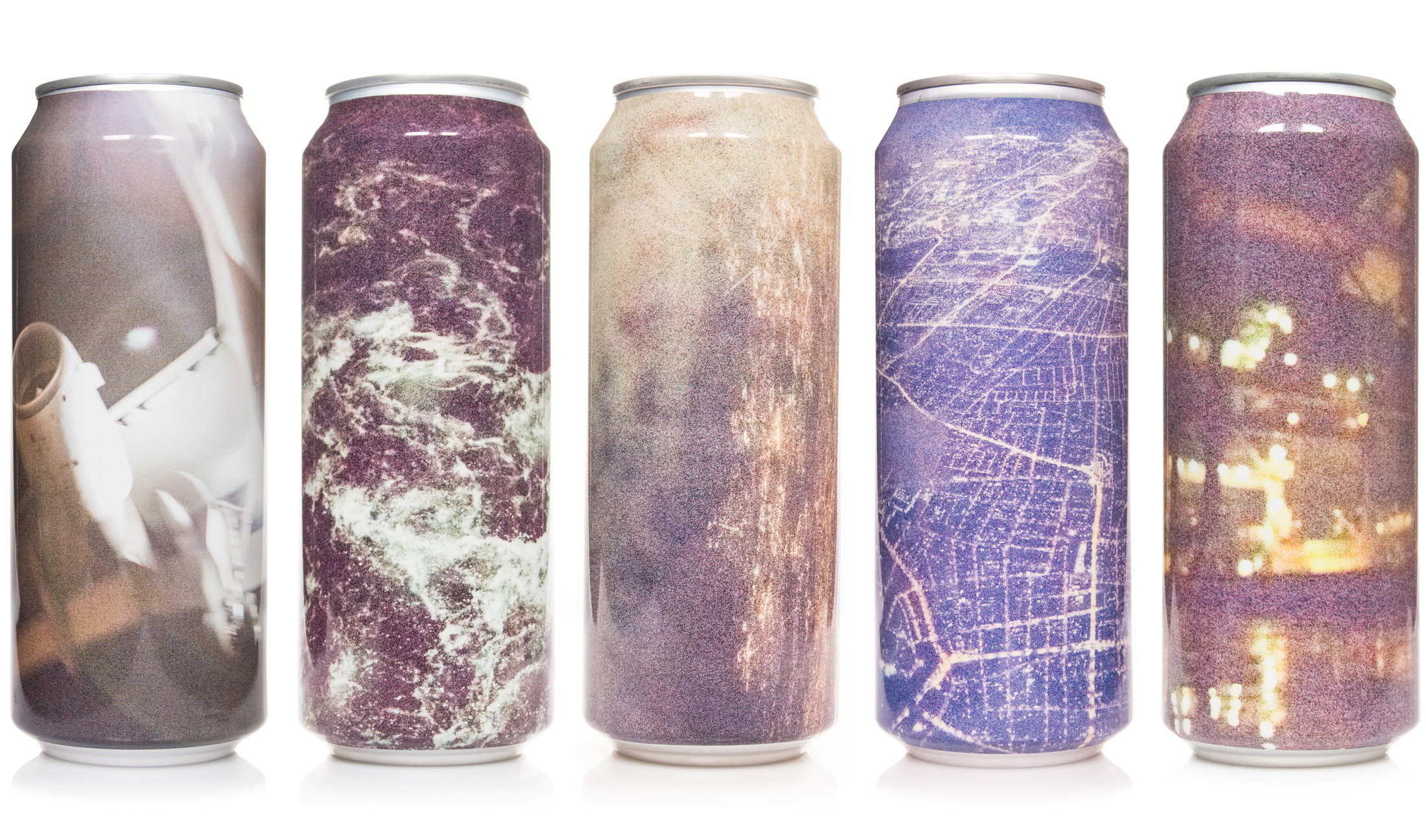
Various designs for the Sur Series. They are all based on extremely grainy photos depicting various subjects. The grainy nature of the images seems as a good way to illustrate a series of sour beers (sur is Danish for Sour). The photos are shot in very low light conditions and the light sensitivity of the camera has been set to maximum. They are seriously underlit, technically speaking. These photos is perhaps more about the texture and the digital artefacts then about the actual subject matter.
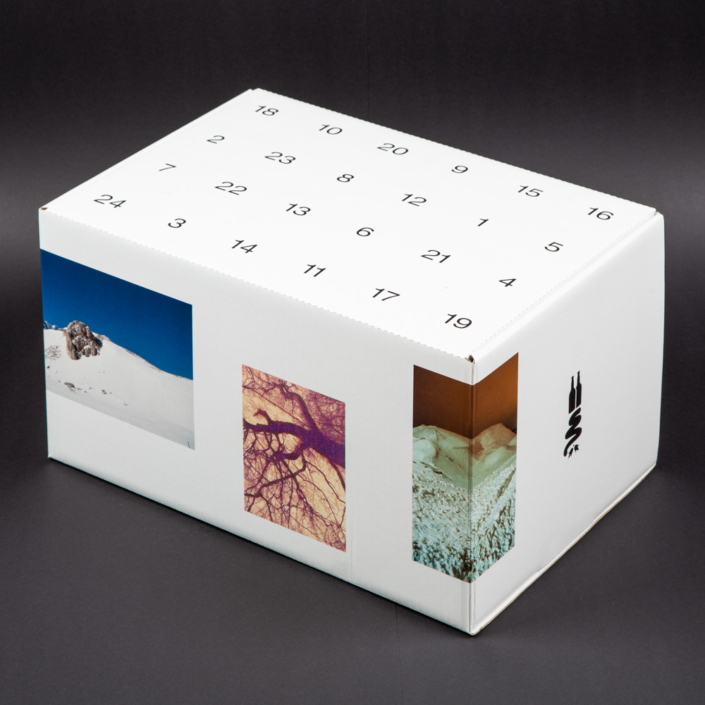
Photos and graphic design for the official To Øl Christmas calendar which (maybe unsurprisingly) contains beer. Various photographs is organized rather casually on the sides of the box. The photos is depicting or referring to winter or snow, some in more obvious ways then others. Direct references to the aesthetics of Christmas has been avoided and a somewhat plain typeface is used on the top of the box for the dates.
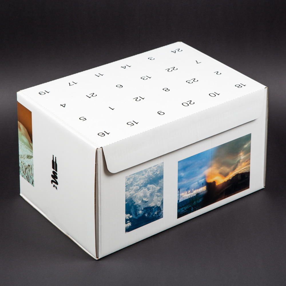
The back of the Christmas calendar.
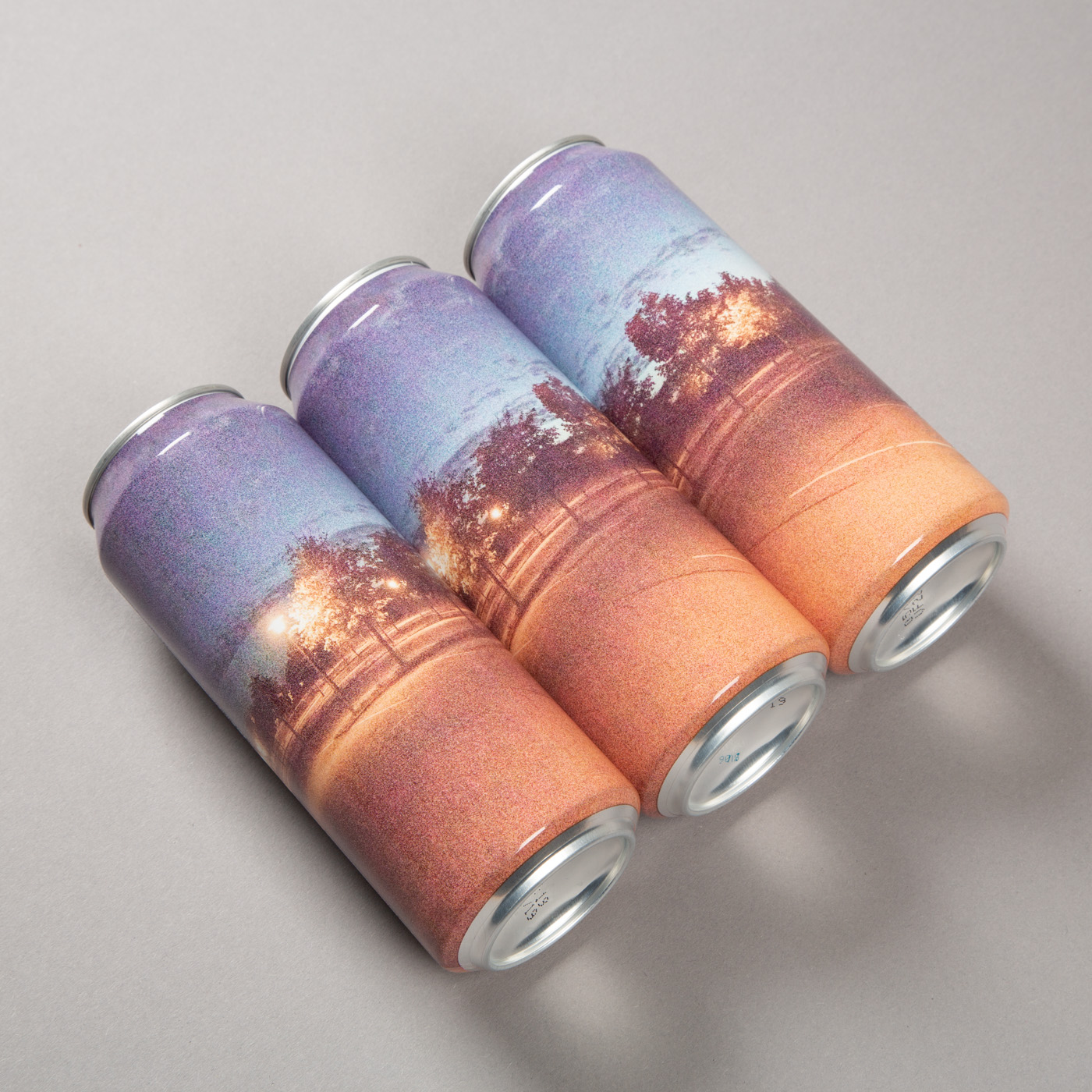
Design for Sur CascadeXCascade 50cl can. Like the other instalments in the Sur Series the artwork consists of an extremely grainy photo shot in low light conditions. The photo depicts a parking lot in southern Zealand and was shot around midnight.
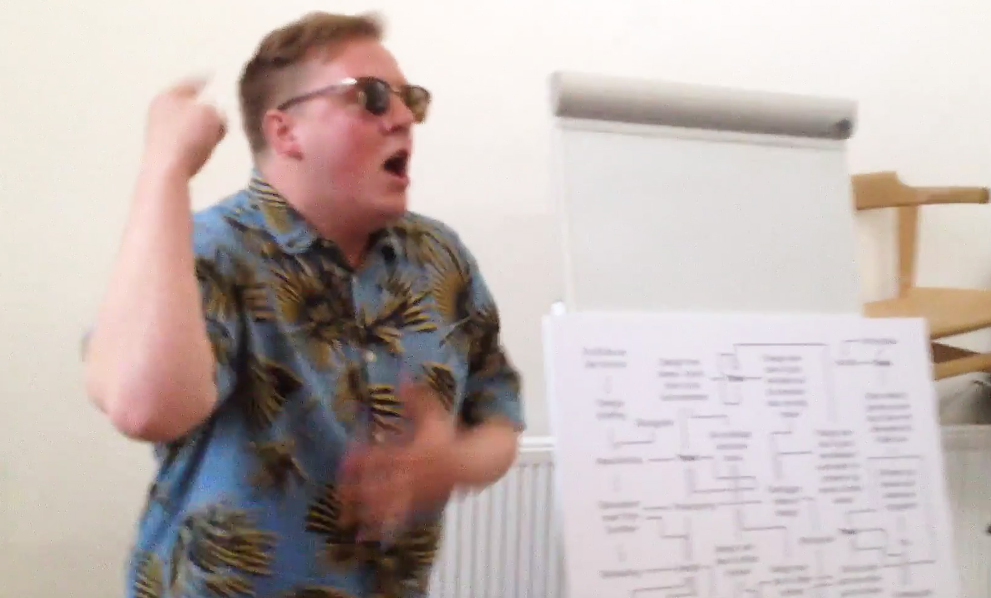
The actor Jesper Ole Feit Andersen during a performance at Designmuseum Danmark. He was shouting, screaming, talking and singing his way through the performance “Er der penge i det?” about my work for To Øl. Josa Barck played guitar and of course an image of the notorious Fiat Multipla was involved. Thanks to Anja Stegger Sørensen and Anders Eske Laurberg Hansen from Designmuseum Danmark for inviting us.
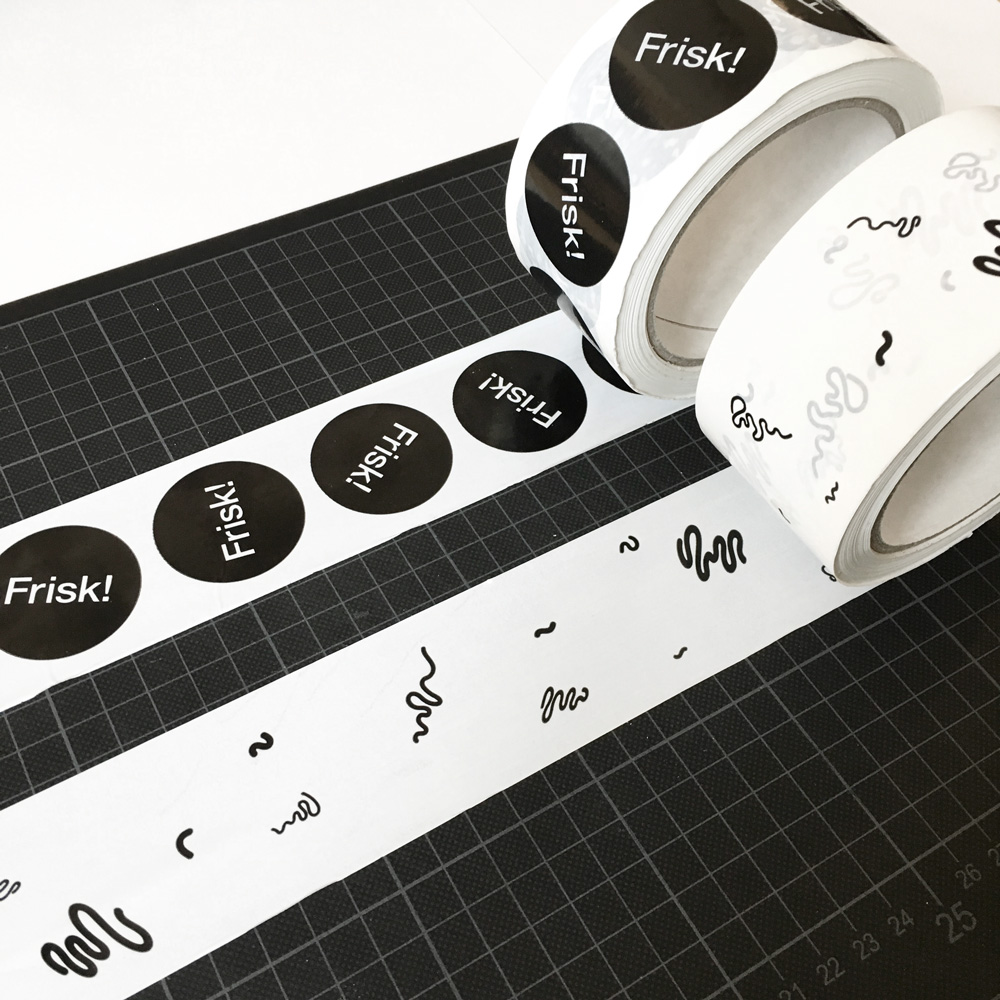
Wrapping tape design for the To Øl webshop.
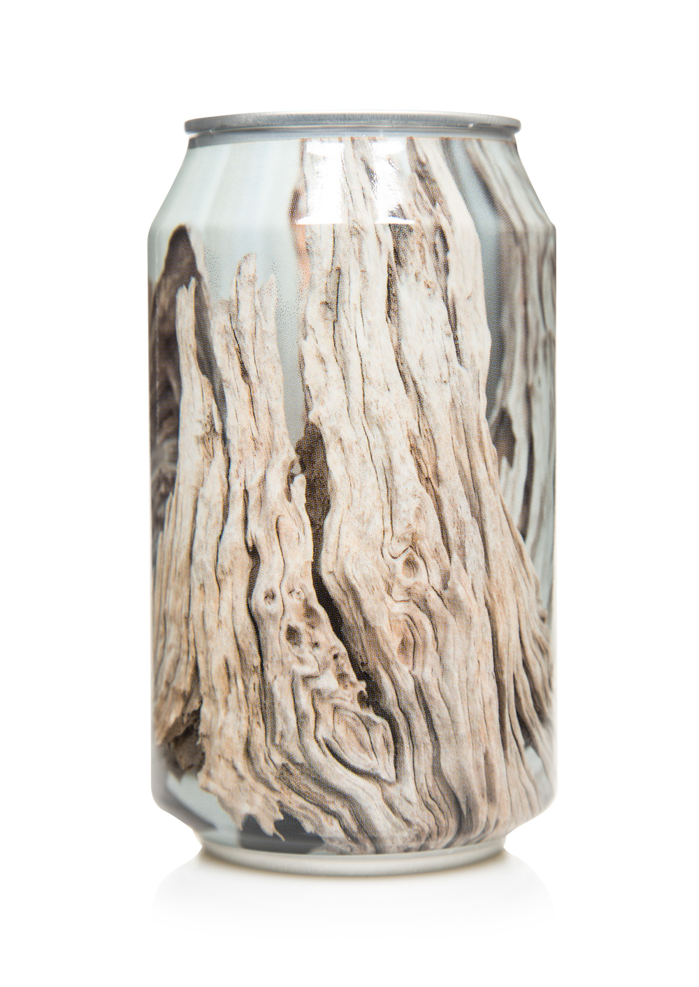
Totem Passion 33cl can. The design features a closeup photo of a window display where several beautiful pieces of wood is exhibited. It is not clear what the purpose of the display is since there are no text or signs explaining anything. It could be a kind of shop or an alternative therapist maybe even a cult or sect or something entirely different. It is rather refreshing with a bit of mystery in our structured and repetitive everyday lives.
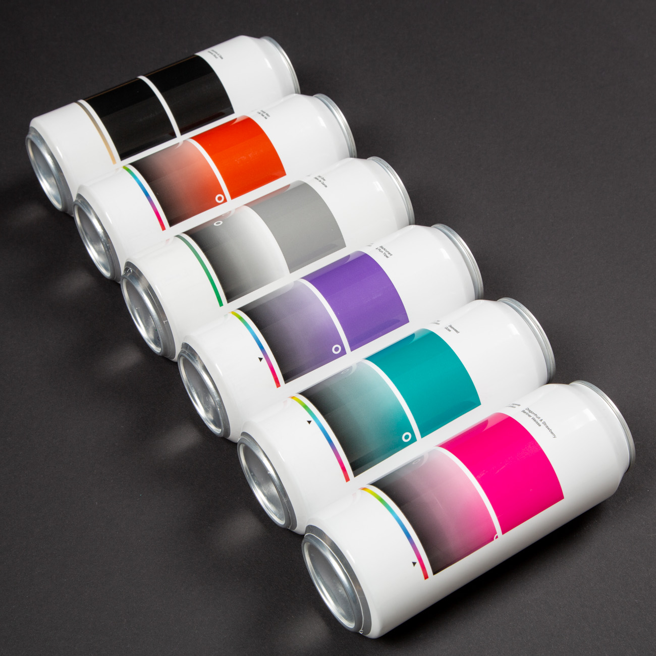
Design for the six instalments in the Ms. Series by To Øl. Each beer is named after a colour that also directs the ingredients. The artworks features colour pickers known from graphic applications like Photoshop or Illustrator. The colour picker is a reference to the act of graphic design itself and the process that went into creating the artworks.
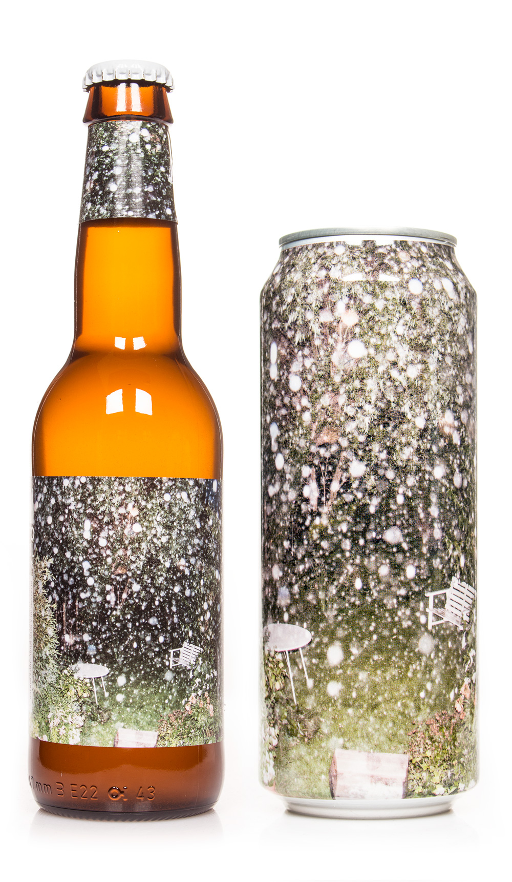
Photo shot during a cloudburst in the middle of summer. The flash makes the raindrops look like snowflakes. Design for Blizzard in a Beer Mug.
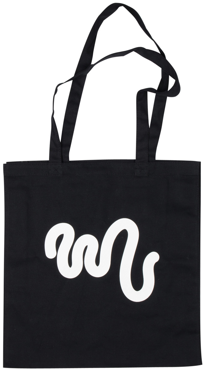
Tote bag design. The doodle could be representing a germ or bacteria as a reference to fermentation and brewing. It was made using a drawing tablet. I swiftly made a lot of versions so I could choose the best afterwords. It puzzled me that all of them looked the same until I realized I was basically doing variations of my signature. So I actually ended up “signing” the tote bag.
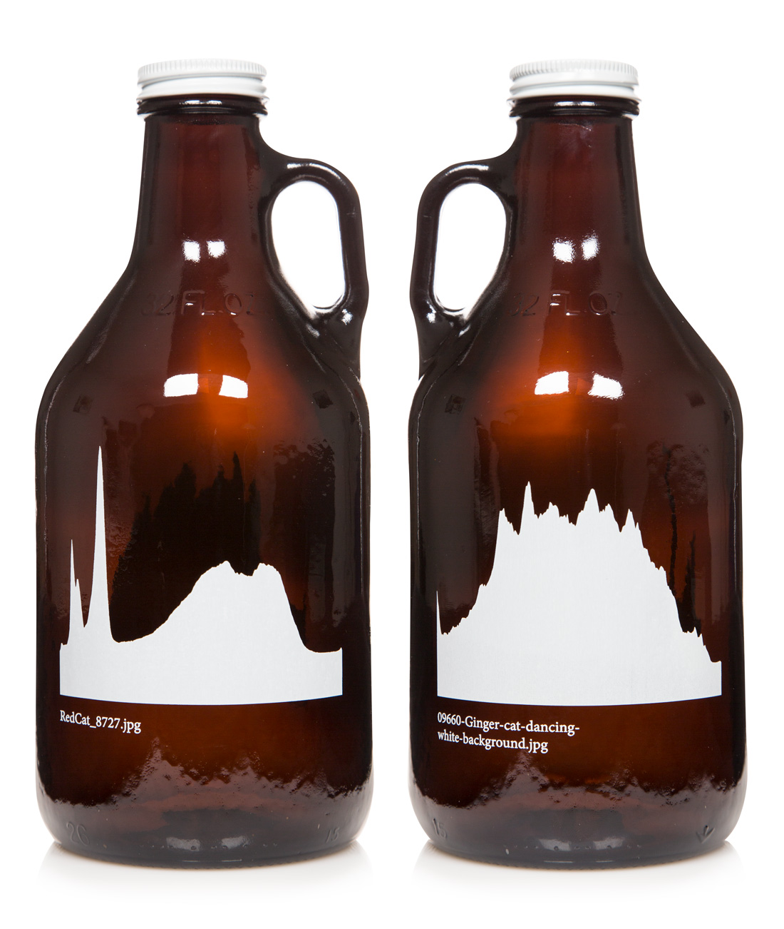
Growler with histograms based on random cat pictures. Made with help from engineer Mikkel Melin.
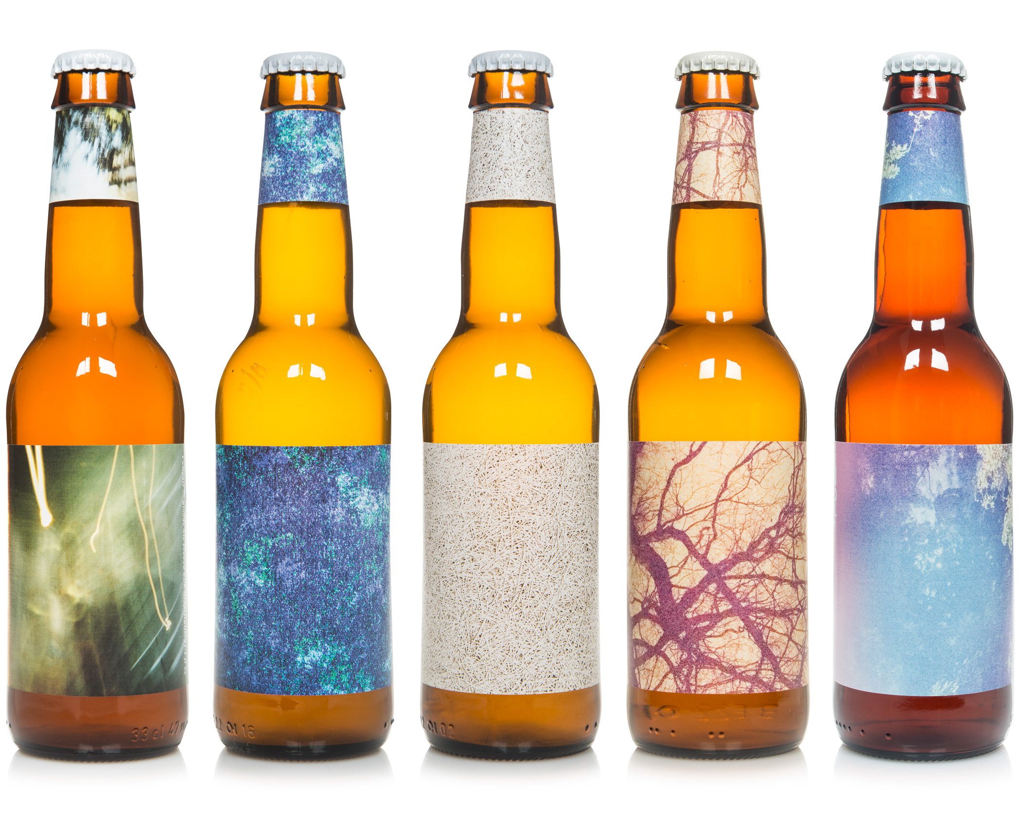
Photography based labels on 33cl bottles. From the left: Campale - Blonde Ale with Grapefruits, My Fruity Pils - Quaffable Session Pilsner Brewed with Passion Fruit, Pink Guava and Papaya, My Sour Pils - Quaffable Sour Mashed Session Pilsner, Sur Tangerine - Mosaic Shandy, Sur Equinox - Sour Pale Ale
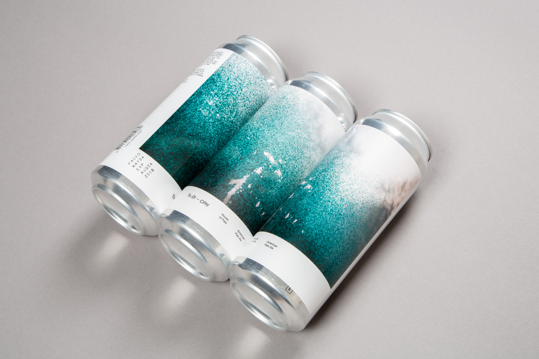
“House of Pale” was the first can to come out of To Øl CPH - To Øl’s production at BRUS. The designs for the cans of To Øl CPH is all based on photos shot in Copenhagen. We wanted to avoid the usual glorified tourist portrayal of the city in favour of a more quirky and abstract approach. The artwork on this beer is a close up photo of graffiti seen from the inside of a commuter train.
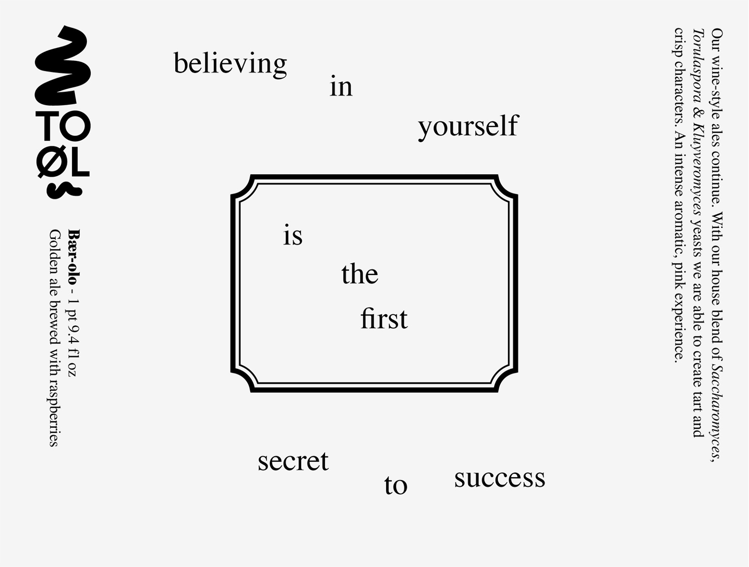
Label design for Bær-olo 75cl bottle. The labels features an archetypical wine vignette countered by a motivational quote. Motivational quotes is both interesting and completely idiotic. The idea that solutions to complex issues in life can be formulated in a single sentence seems utopian on an almost infantile level. But then again, most creative expression is utopian in one way or the other and a good part of the 20th century modernist was trying hard to bring art to the infantile level, so maybe it makes sense after all.
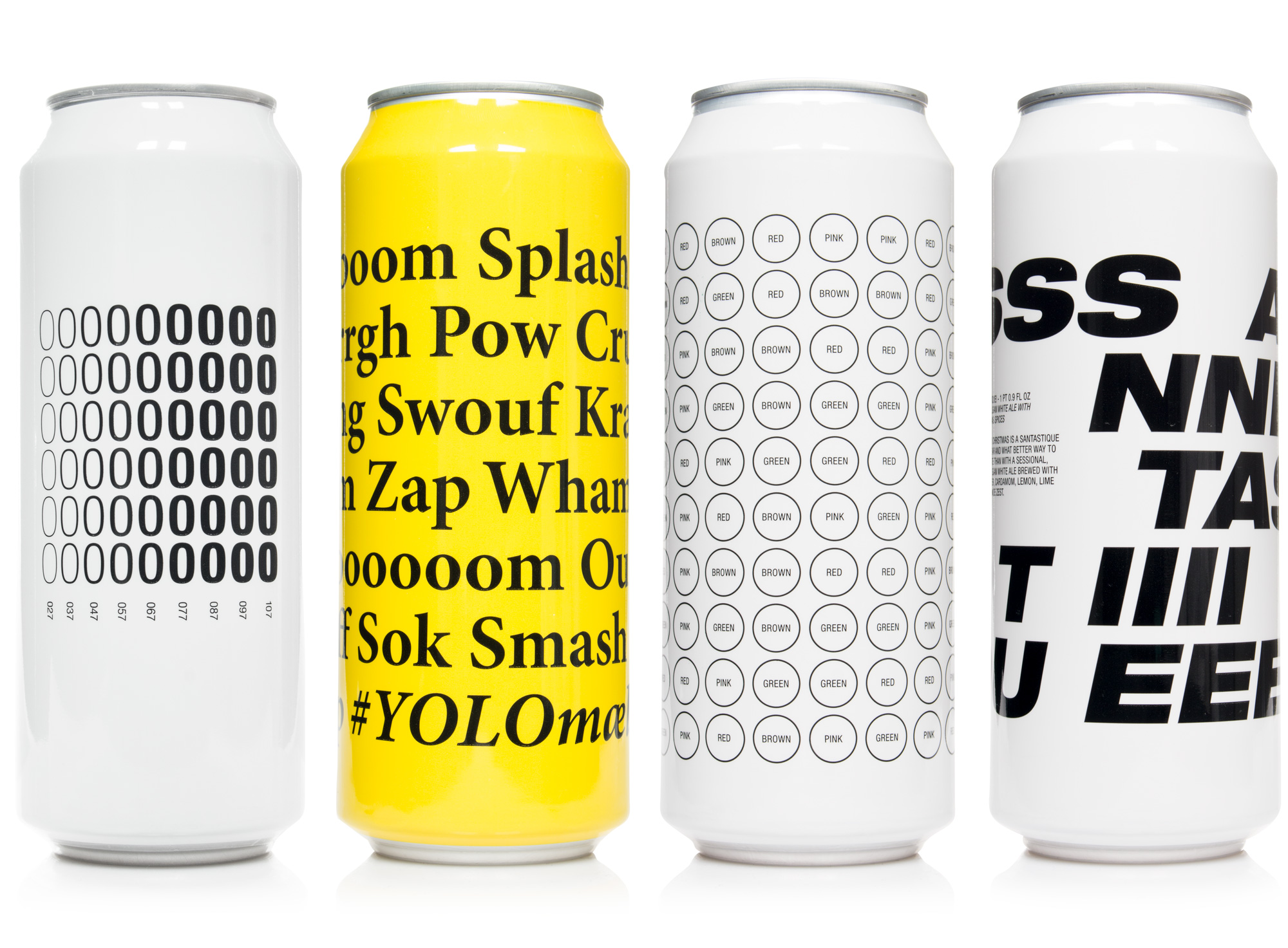
Typography based sleeves on 50cl cans. From the left: Nul - Zero IBU India Pale Ale, #YOLOmælk - Imperial Salty Milk Stout brewed with Caviar and Champagne-yeast, 3XRaid Beer - New England Style India Pale Lager, Santastique! - Hazy Belgian White Ale with Christmas Spices.
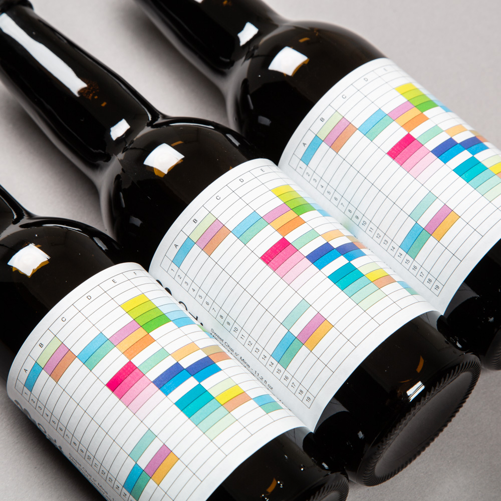
Sweet Chai o’ Mine - Milk stout brewed with a mixture of traditional chai ingredients; ginger, cardamom, cinnamon & star anise. The rich flavours is illustrated by colours organised in a spreadsheet. It is abstract painting in Excel.
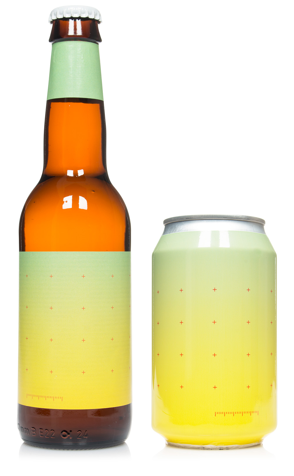
Design for Cloudy 9 bottle and can. The artwork consist of a gradient and a grid of crosshairs. The color scheme is referencing the two special ingredients in the beer: Mango & Orange Peel. The grid of crosshairs is inspired by the photos from the Apollo Missions to the moon where they were used to carry out measurements and correct distortions. Here they are placed over an abstract gradient and becomes formal aesthetic symbols instead of scientific tools.
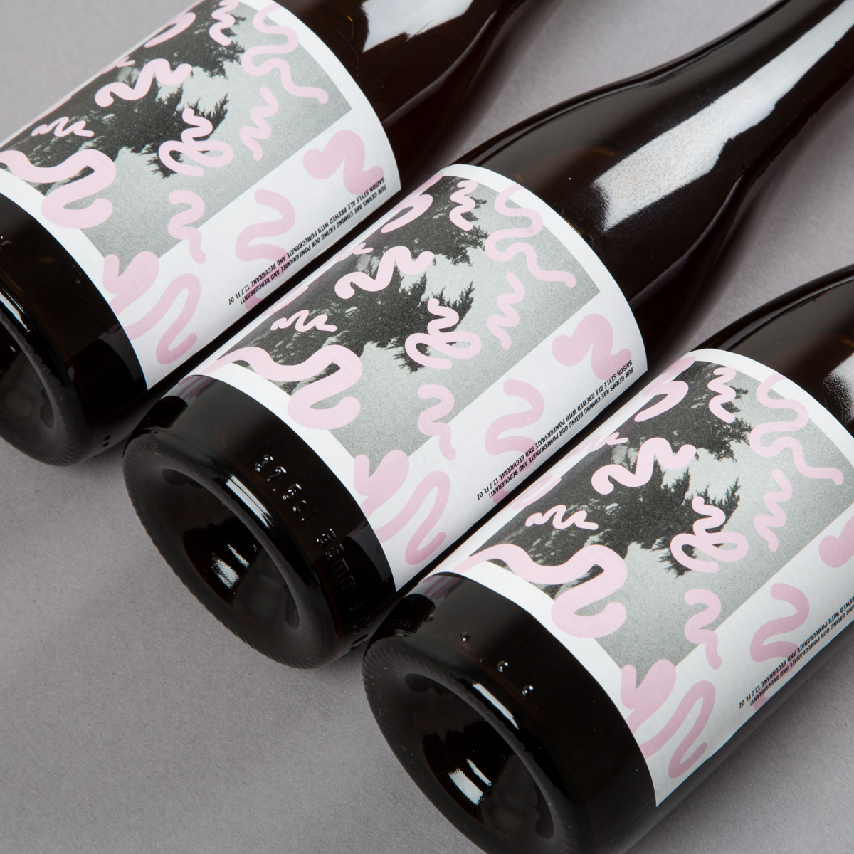
Sur Germs Are Coming Eating Our Pomegranate & Redcurrant” 37,5 cl bottle.
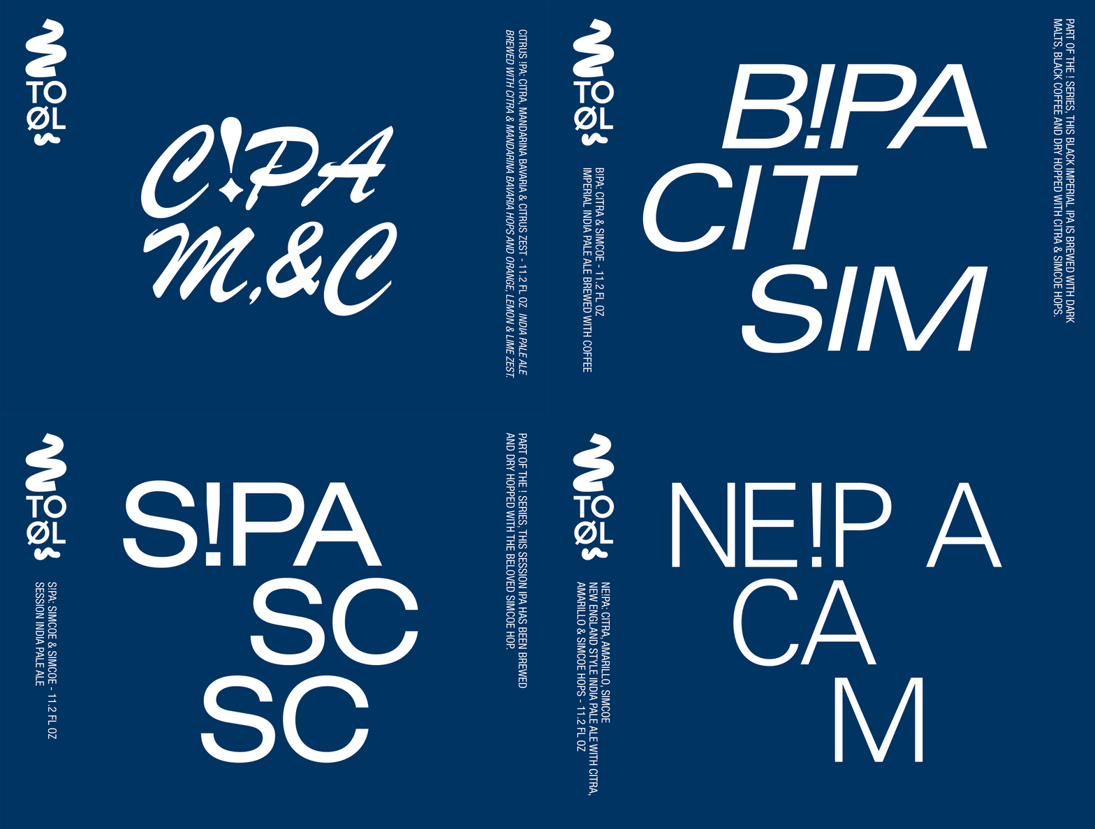
Various typography based labels from the “Shock Series”.
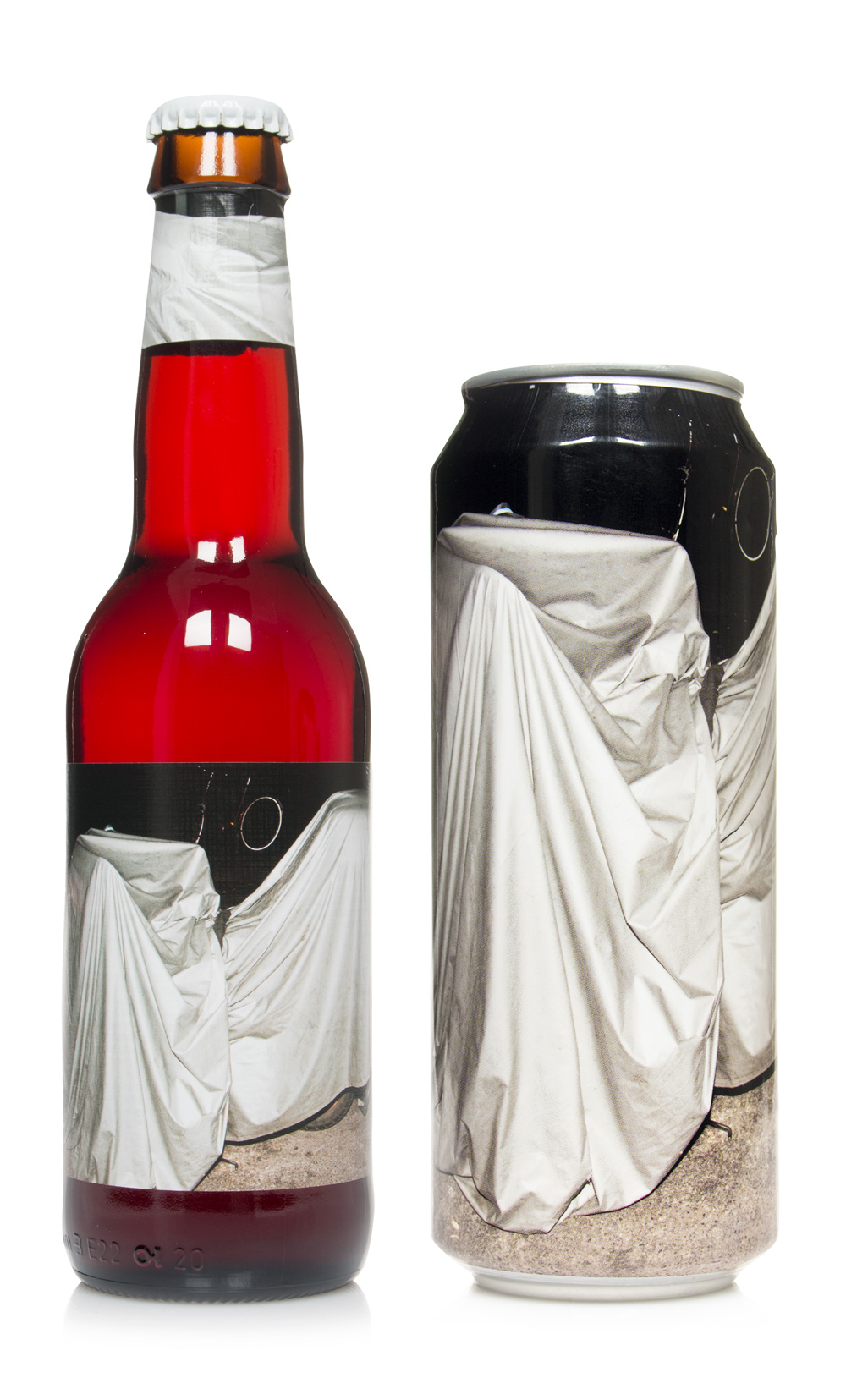
Bottle and can designs for 1 Ton of...Lingonberries. Like the other instalments in the 1 Ton Series the artwork consists of a flash lit photo shot at night. This time it is depicting a motorcycle wrapped in a protective cover.
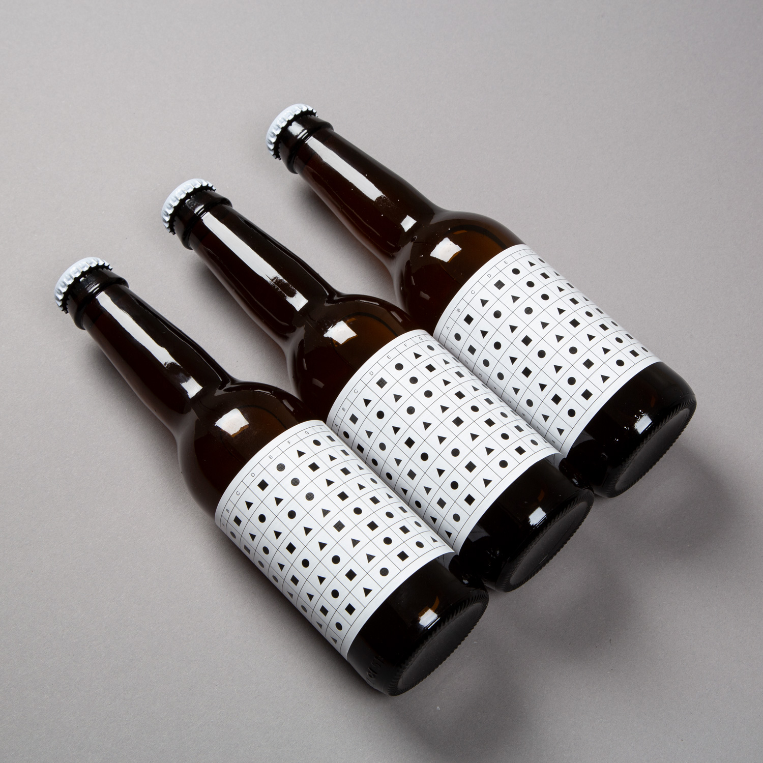
Label design for Trocken. The artwork consists of a spreadsheet organizing triangles, squares and circles. These shapes serve as abstractions in the otherwise rational spreadsheet and they also act as a references to the Bauhaus. The beer is inspired by Germany and thus it seemed appropriate to pay homage to Germany's most influential art school. The square, circle and triangle has been associated with the Bauhaus since Wassily Kandinsky used them as part of a psychological colour test at the school in 1923. The spreadsheet is a product of the computer age but its grid-like structure could be derived from the aesthetics of modernism or maybe more precise the kind of functional and rational modernism that Bauhaus was promoting.
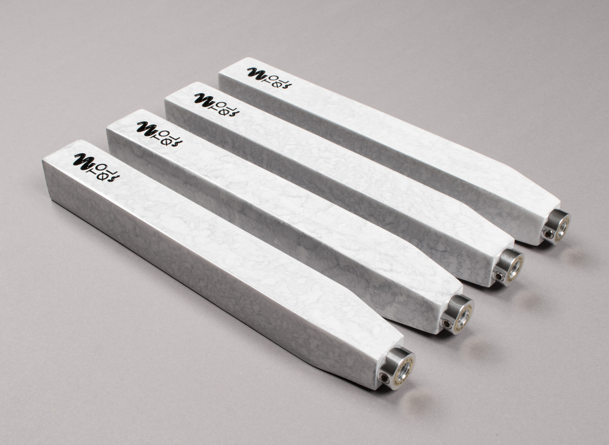
Taphandles – A monolithic form inspired by a obelisk is cast in urethane. A fake marble paint effect is applied so that each handle gets a unique pattern.
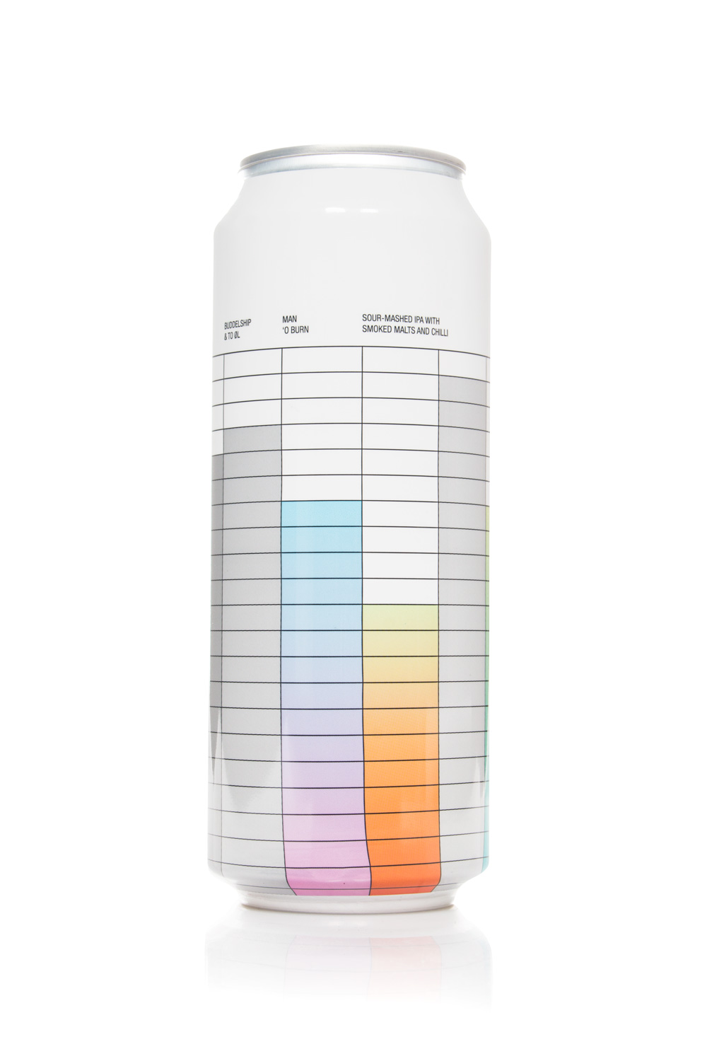
Design for “Man ‘O Burn” 50cl can. The artwork consist of a spreadsheet like grid organizing various gradients and grey rectangles. The artwork is applied on the can using a technique called shrink wrapping where a printed piece of plastic is shrinked to fit around the can using boiling water. The distortion in the lower part of the grid is caused by the shrink wrapping process and is a nice little reference to the production of the can.
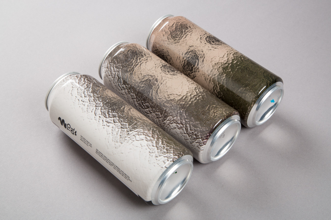
The Haze Craze IPA 50cl Can. The design consists of a photo shot through some frosted glass depicting some kind of building or structure. The image has been turned 90 degrees. The blurriness of the artwork caused by the frosted glass is a reference to the hazy nature of the beer. Furthermore the image is balancing just on the verge of abstraction. It could be mistaken for a painting or a Photoshop generated artwork. It is not about photography's ability to make believable representations of reality. It is about the texture of the image and the almost tactile quality of the final print.
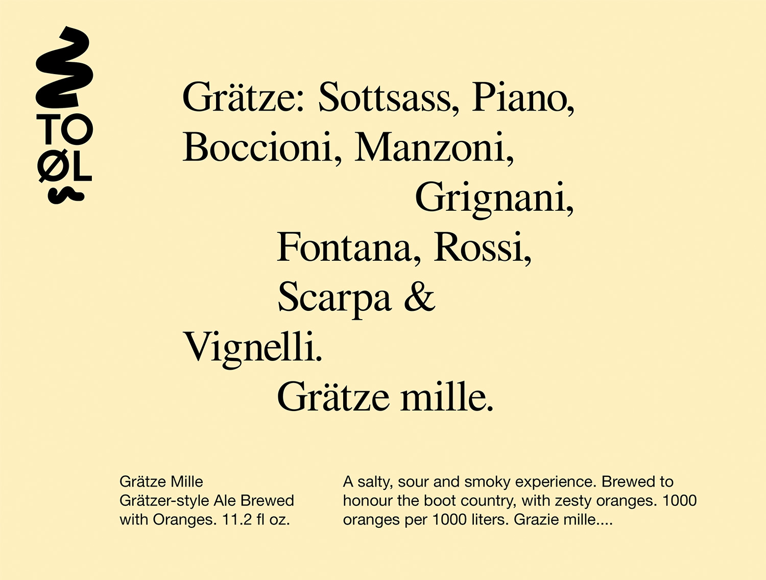
The boys at To Øl wanted to do a tribute beer to Italy brewed with a lot of oranges. The beer is called Grätze Mille - a combination of the type of beer and the italian words for thanks a lot. So for the label I decided to say thank you to my italian heroes in design, architecture and art.
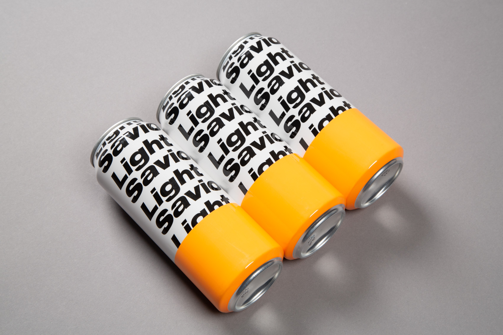
There is a strange correlation between maritime life saving equipment and the aesthetics of techno clubs. Design for light Saviour - Juicy Session India Pale Ale 50cl can.
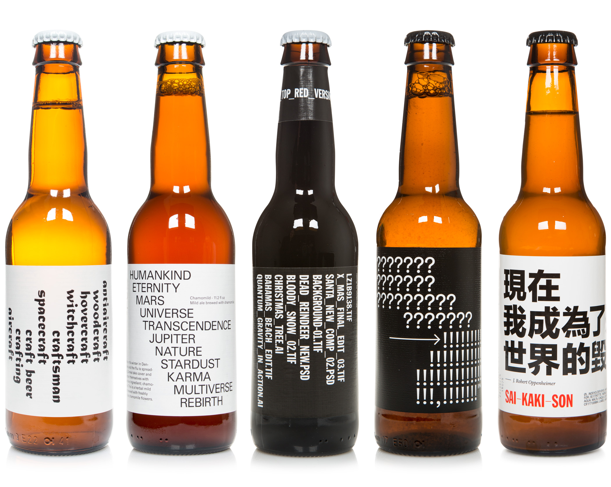
Typography based labels on 33cl bottles. From the left: Nettles in the Kettles - Saison-style Ale Brewed with Nettles, Chamomild - Mild Ale Brewed with Chamomile, Black Bauble - Black Ale with Cardamom & Orange Peel, ?! - India Pale Ale, Sai-Kaki-Son - Persimmon Saison.
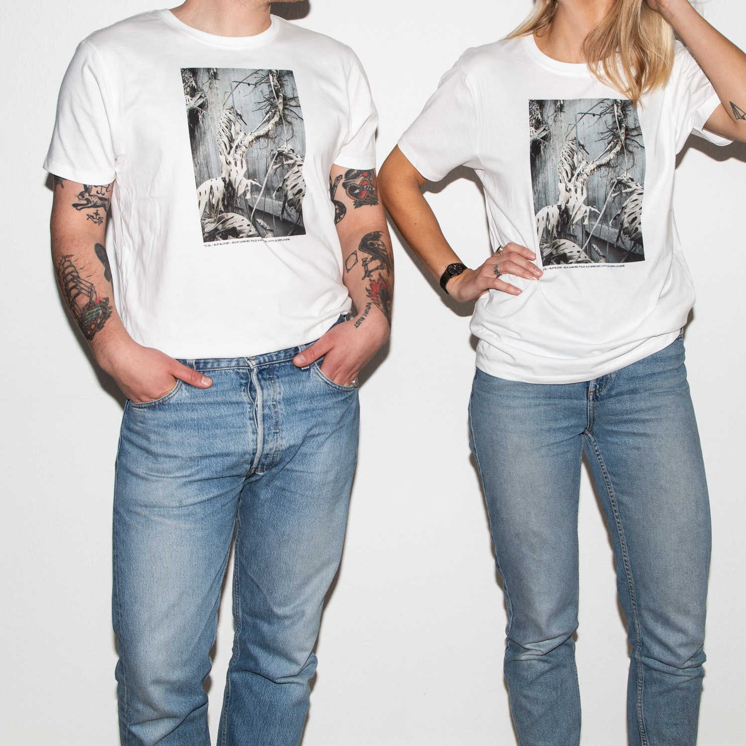
Sur Blomst t-shirt. The design is based on a photo shot at the abandoned Danmarks Akvarium, a former public aquarium located north of Copenhagen. The dead plant was growing in the main gallery as part of a large arrangement of various “natural” habitats. The image is both an obvious reference to the name of the beer: Sur Blomst literally meaning sour flower. It is also a homage to the decaying and forgotten. The dead plant against the cast-in-situ concrete wall seems very beautiful in it’s own rights.
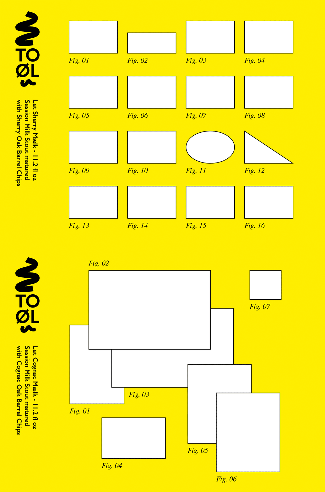
Label designs for the two barrel aged versions of Let Mælk. The compositions refers to the display of artworks in a gallery and how such a display would be represented in an exhibition catalogue. The labels does only supply the diagram of artworks and don’t reveal what they a representing. This part is left to the imagination of the viewer.
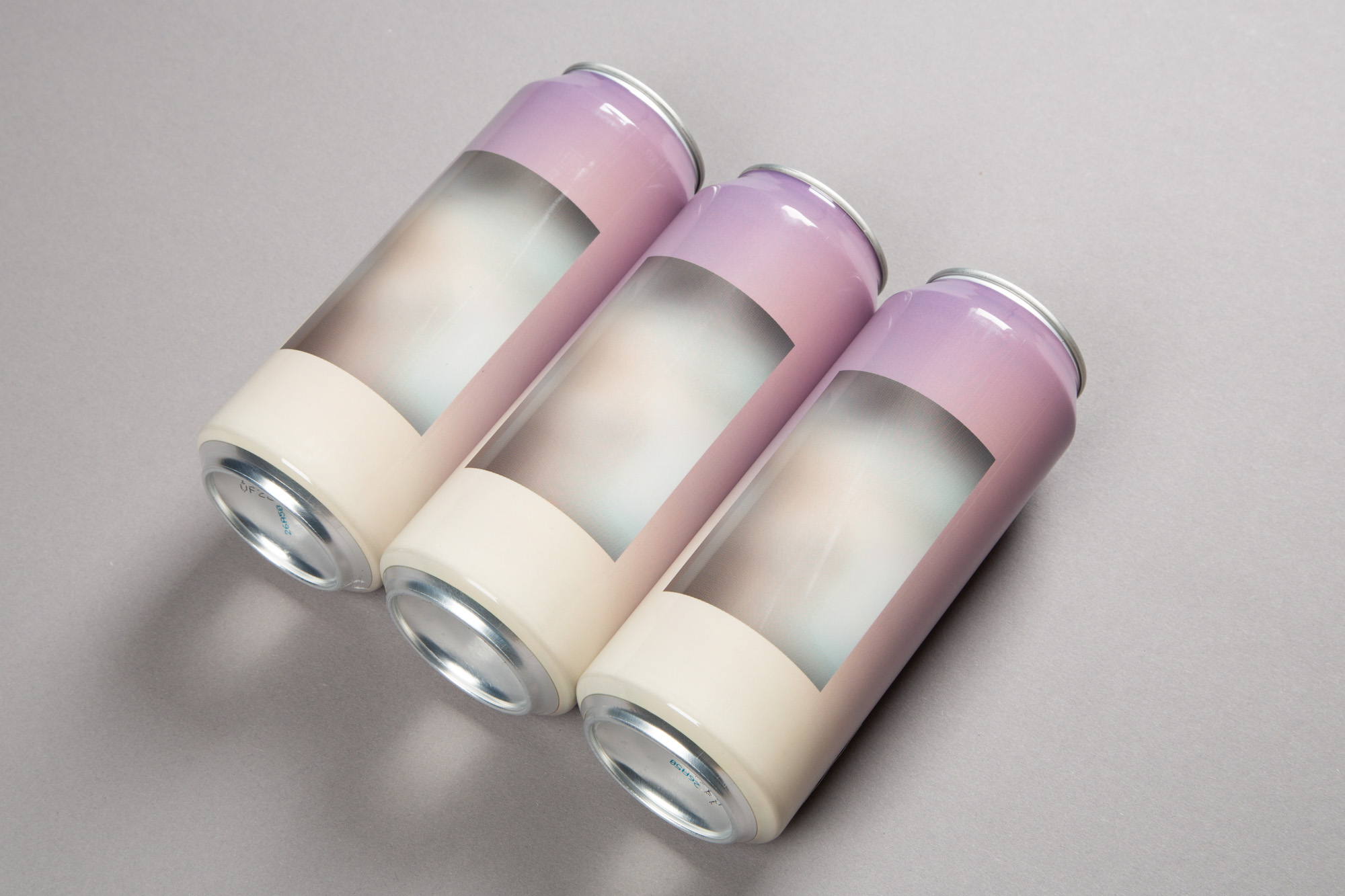
Design for Fuck Art This is Juicy 50cl can. The artwork consists of two photos from previous To Øl designs that has been blurred into obscurity and place on top of each other.
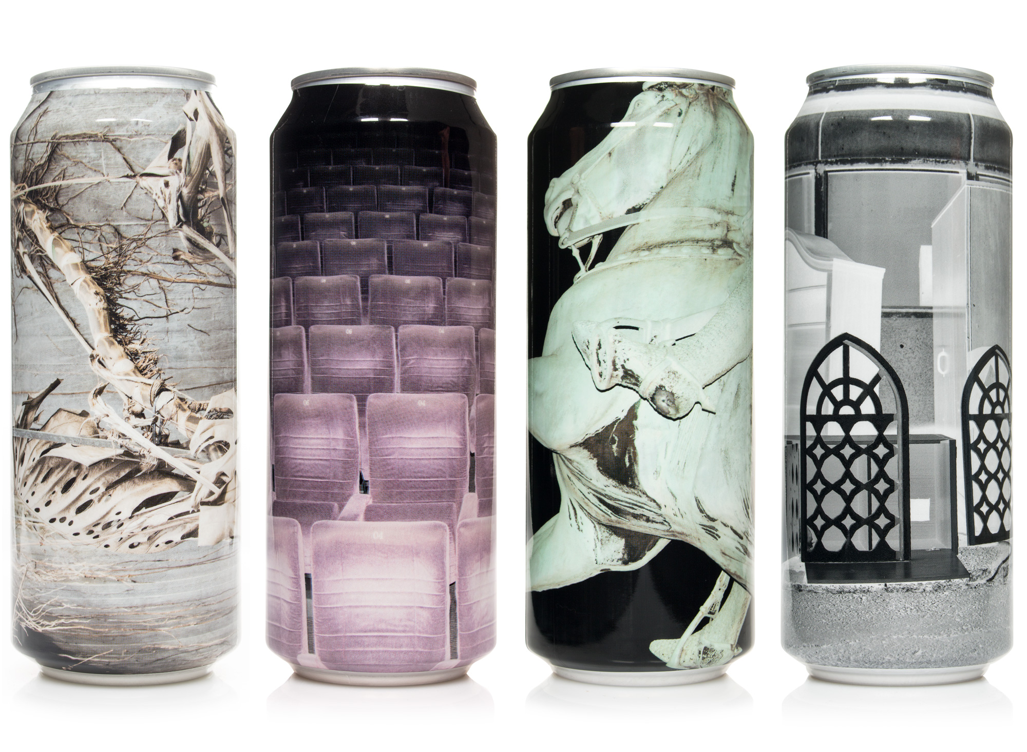
Photography based sleeves on 50cl cans. From the left: Sur Blomst - Sour Mashed Pale Ale Brewed with Elderflowers, 1 Ton of... Rosehip - Sour Ale with Rosehip, 1 Ton of...Blackcurrant - Sour Ale Brewed with Blackcurrant, Slap Yourself Silly - Birch Wheat India Pale Ale.
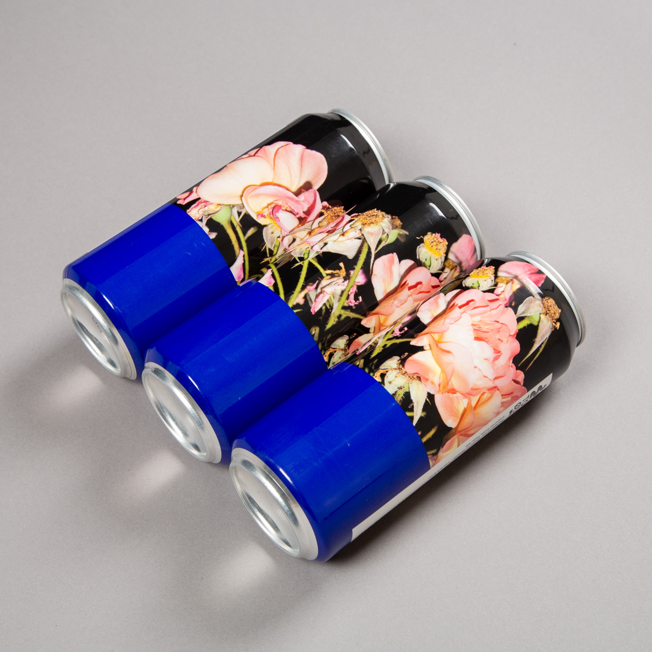
Design for Dangerously Close to Stupid 50cl can.
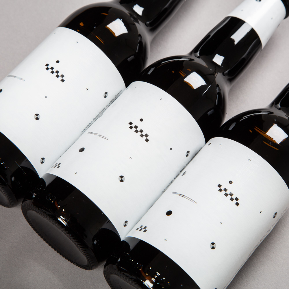
The label for “Stress Test” is composed of various graphic elements known from car crash tests and a lot of empty white space. The beer is about how far you can push a lager strain. Just as the label is about how little visual information you need and how far you can push emptiness. This is definitely an interesting theme that requires more experimentation.
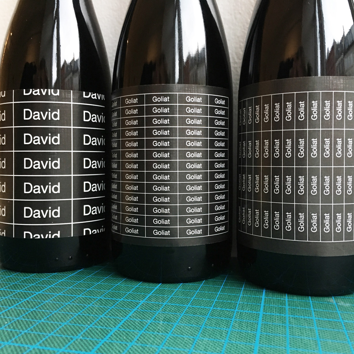
From the left: David - Double Shot Coffee Stout, Goliat Bourbon Oak Chips Edition and Goliat Sherry Oak Chips Edition.
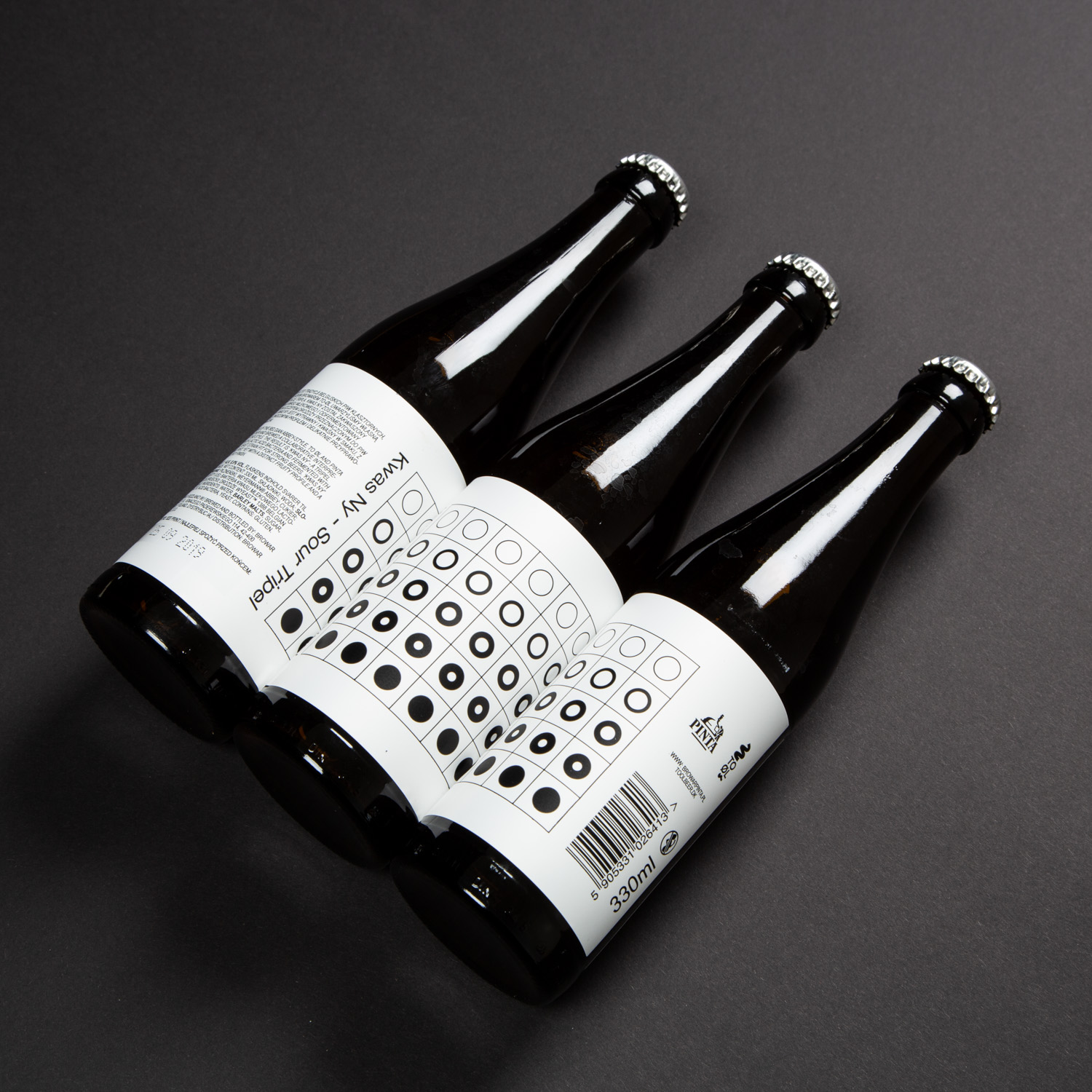
Label design for Kwas Ny - Sour Tripel 22cl bottle.
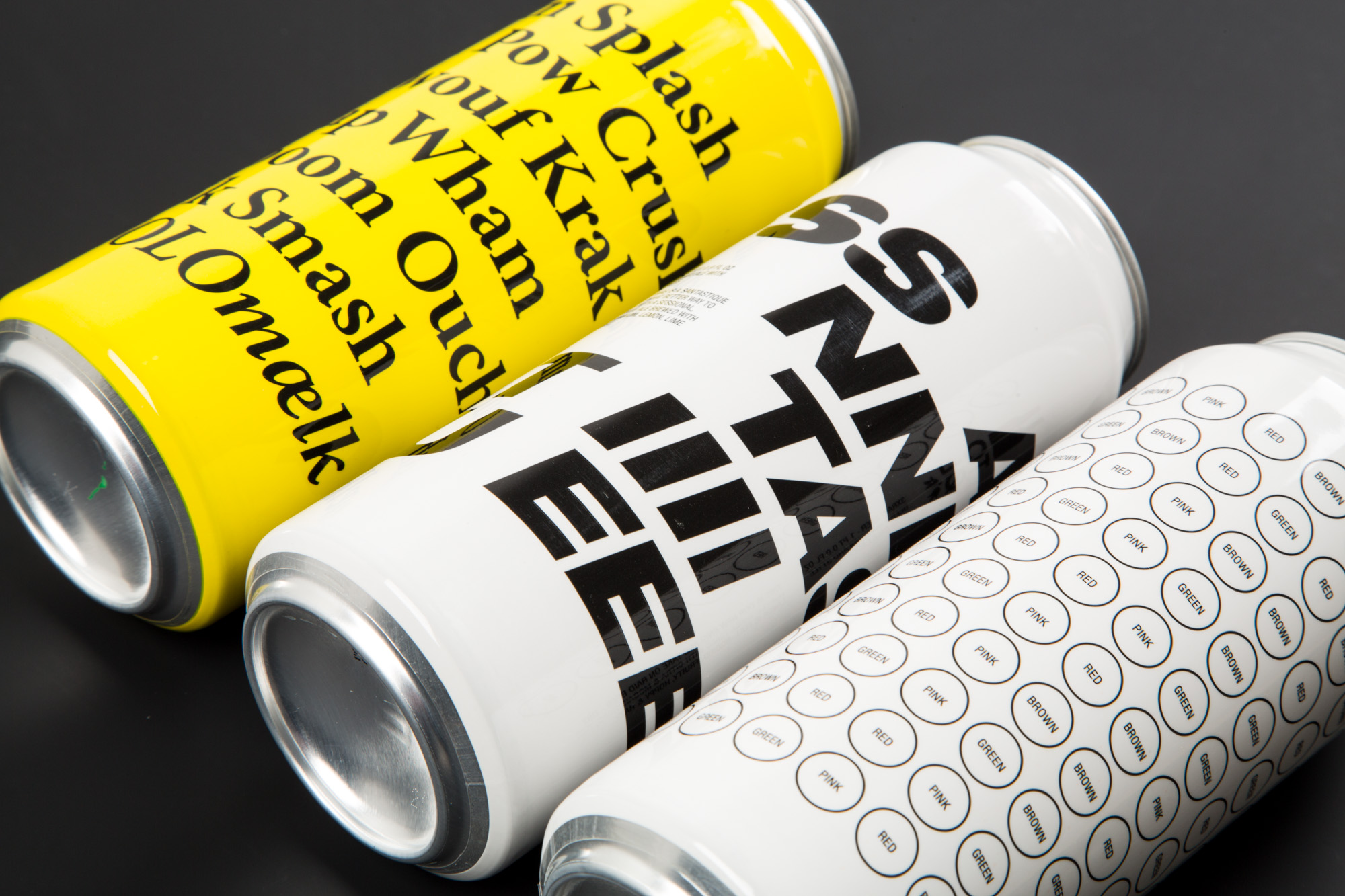
Typography based sleeves on 50cl cans. From the left: #YOLOmælk - Imperial Salty Milk Stout brewed with Caviar and Champagne-yeast, Santastique! - Hazy Belgian White Ale with Christmas Spices, 3XRaid Beer - New England Style India Pale Lager.
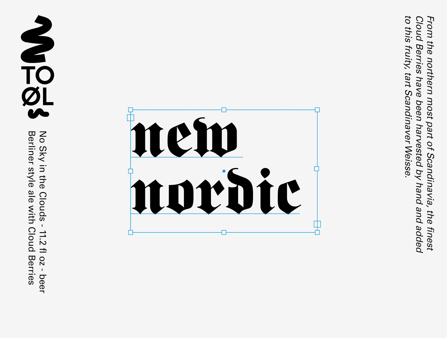
Label design for No Sky in the Clouds 33cl bottle. The beer is brewed with cloudberries so the label became both a reference and a critique of the New Nordic Movement. The idea of the “New Nordic” originates in haute cuisine and was definitely a breath of fresh air that gave birth to new and exciting ways of cooking. I guess my problem with the New Nordic Movement is the notion of authenticity. The idea that there is a true and real way of eating and consuming. I would argue that authenticity does not exist, everything is a construction, equally fake or real. So for the label “New Nordic” is typed in a gothic script and a bounding box known from applications like InDesign and Illustrator has also been included. Unfortunately this beer was never bottled since it was decided to release it in kegs only, that had nothing to do with the label (as far as I know).
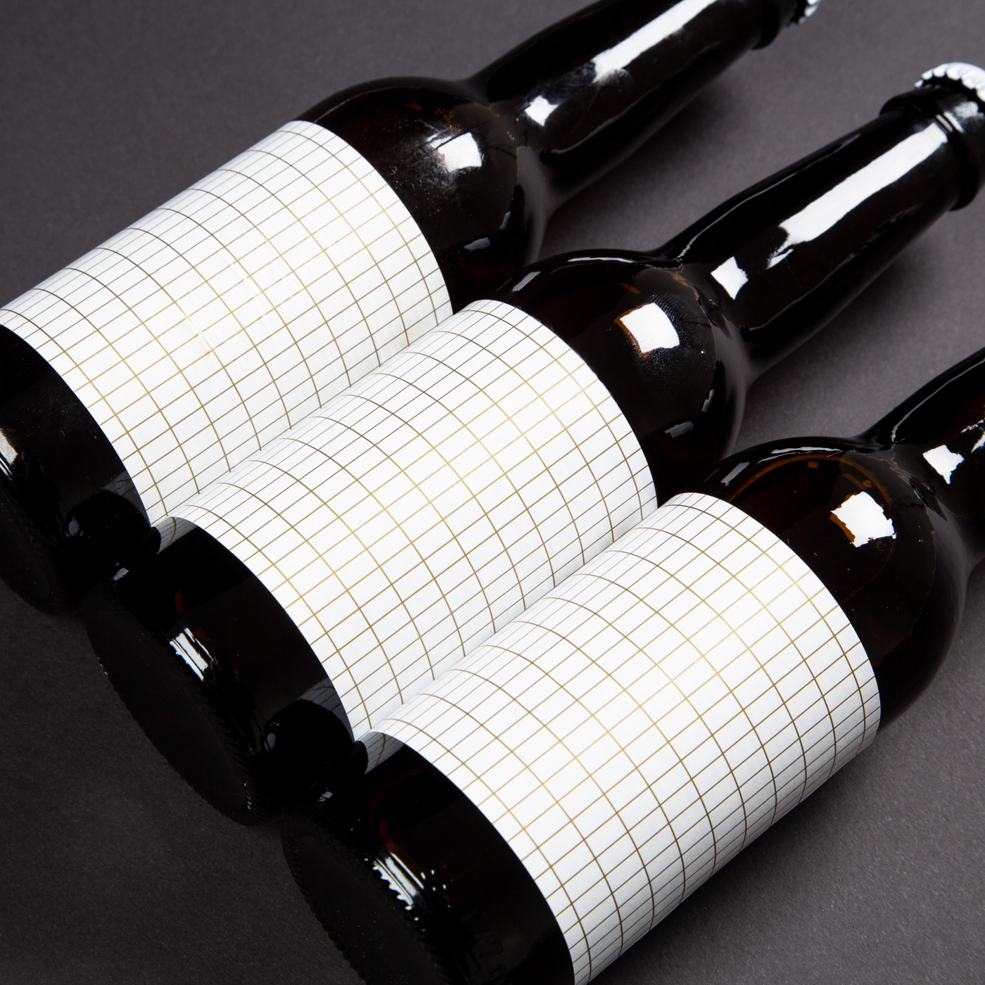
The grid was central to archetypical modernism otherwise known as the International Style. The origin of the grid as a tool to organize architecture, art and design is multifaceted and complex. However German practitioners and teachers did there part to spread the word. From Walter Gropius and the Bauhaus School to the houses and skyscrapers of Mies. Label design for Genau Das! German Pilsner featuring a grid printed with metallic ink.