Rumlig Orientering
2013
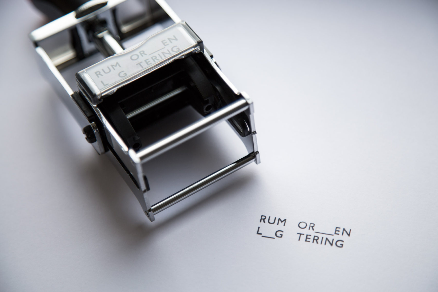
Name and logo for the independent publishers, Rumlig Orientering. A collaboration with Asmus Lauridsen.
Rumlig Orientering is mainly engaged in publishing work on art, architecture and critical thinking. Rumlig Orientering literally means Spatial Orientation and could also be understood as more general information on spatial matters. The name both refers to the actual rooms of the art gallery or within architecture. It is also a reference to the abstract room of society and the groups within it.
The idea of the design was to literally create space within the logo by removing some letters and replacing them with underscores. We also worked with the order which you read the words by dividing each word and placing them side by side.